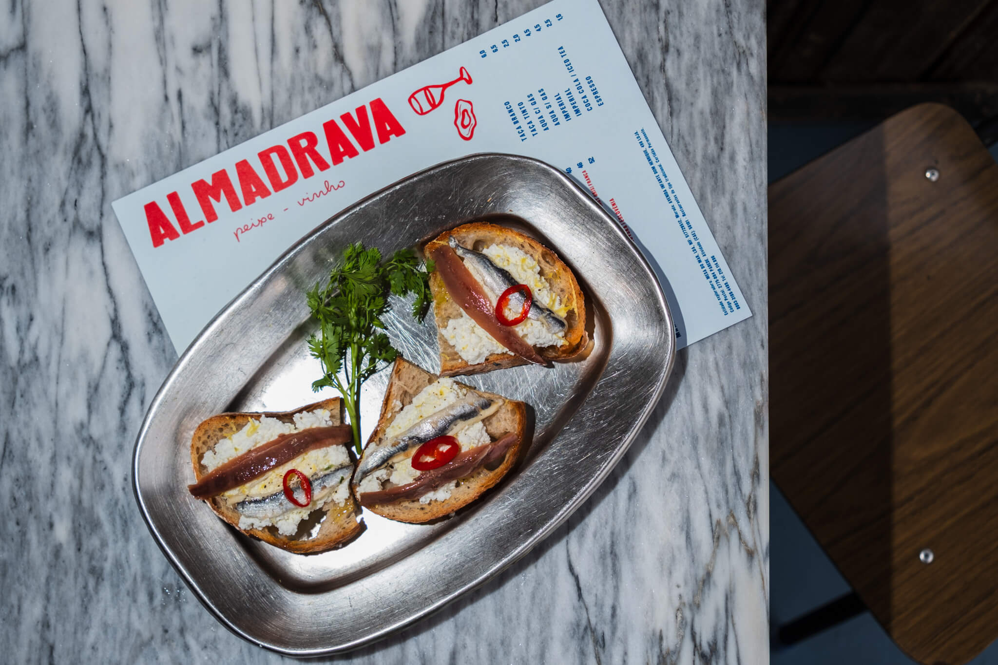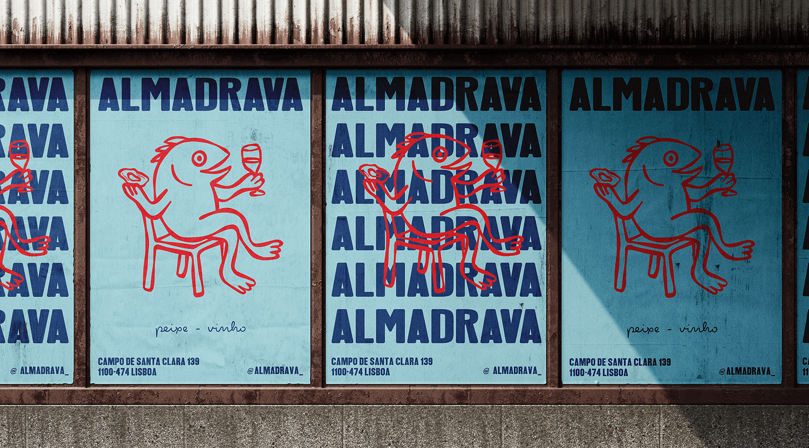
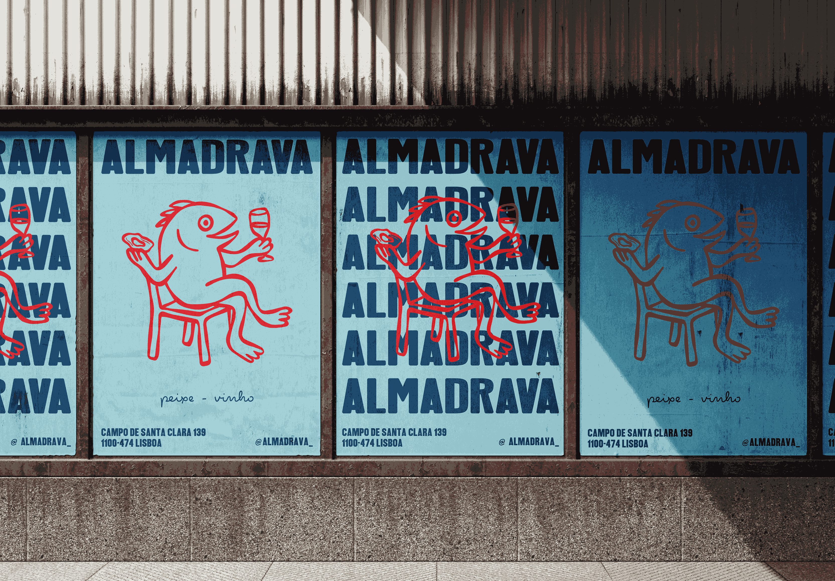
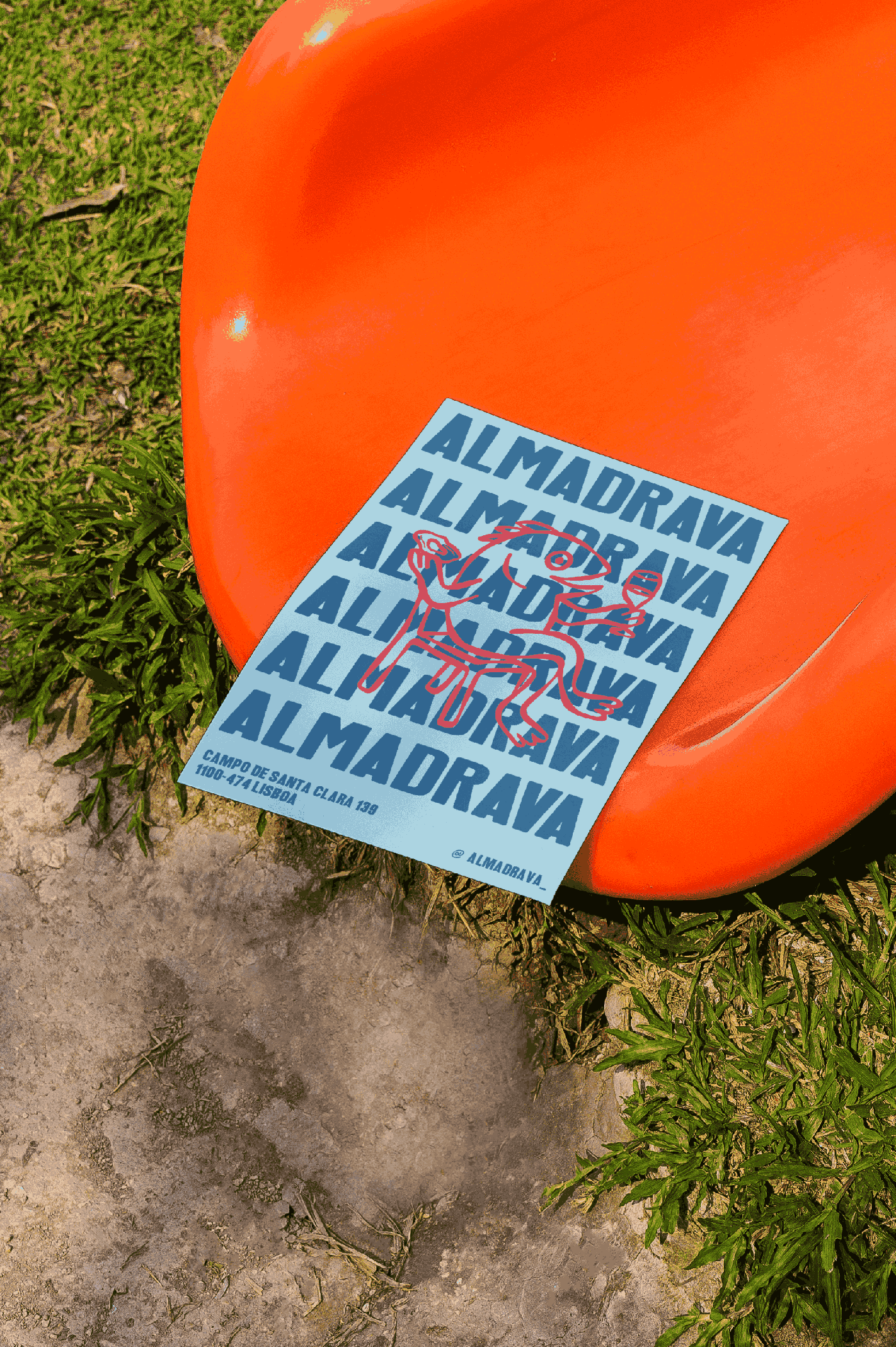
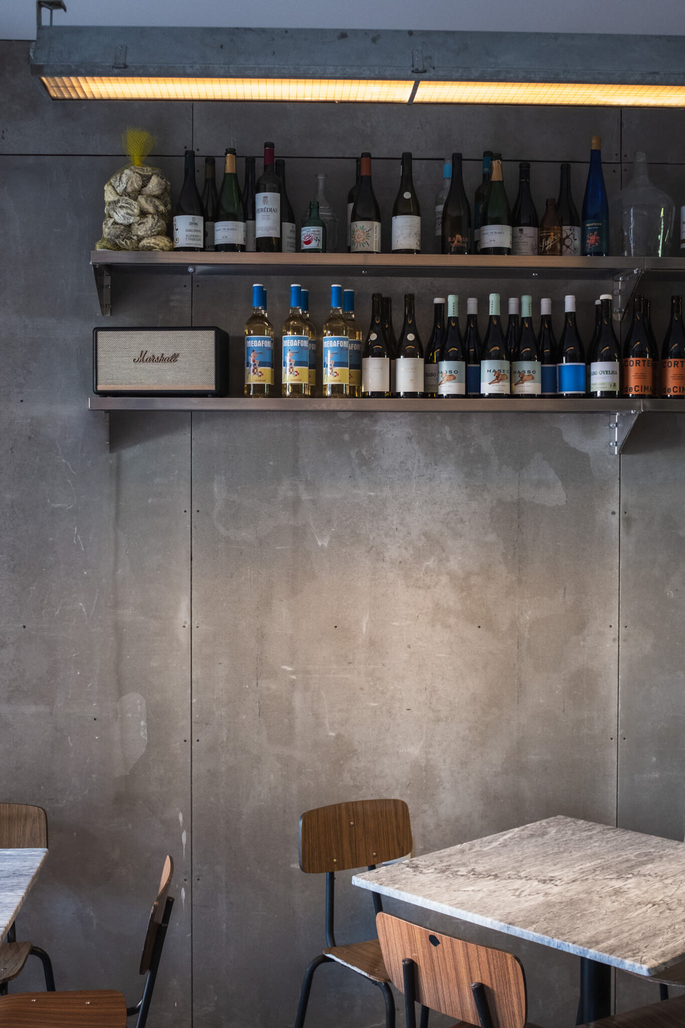
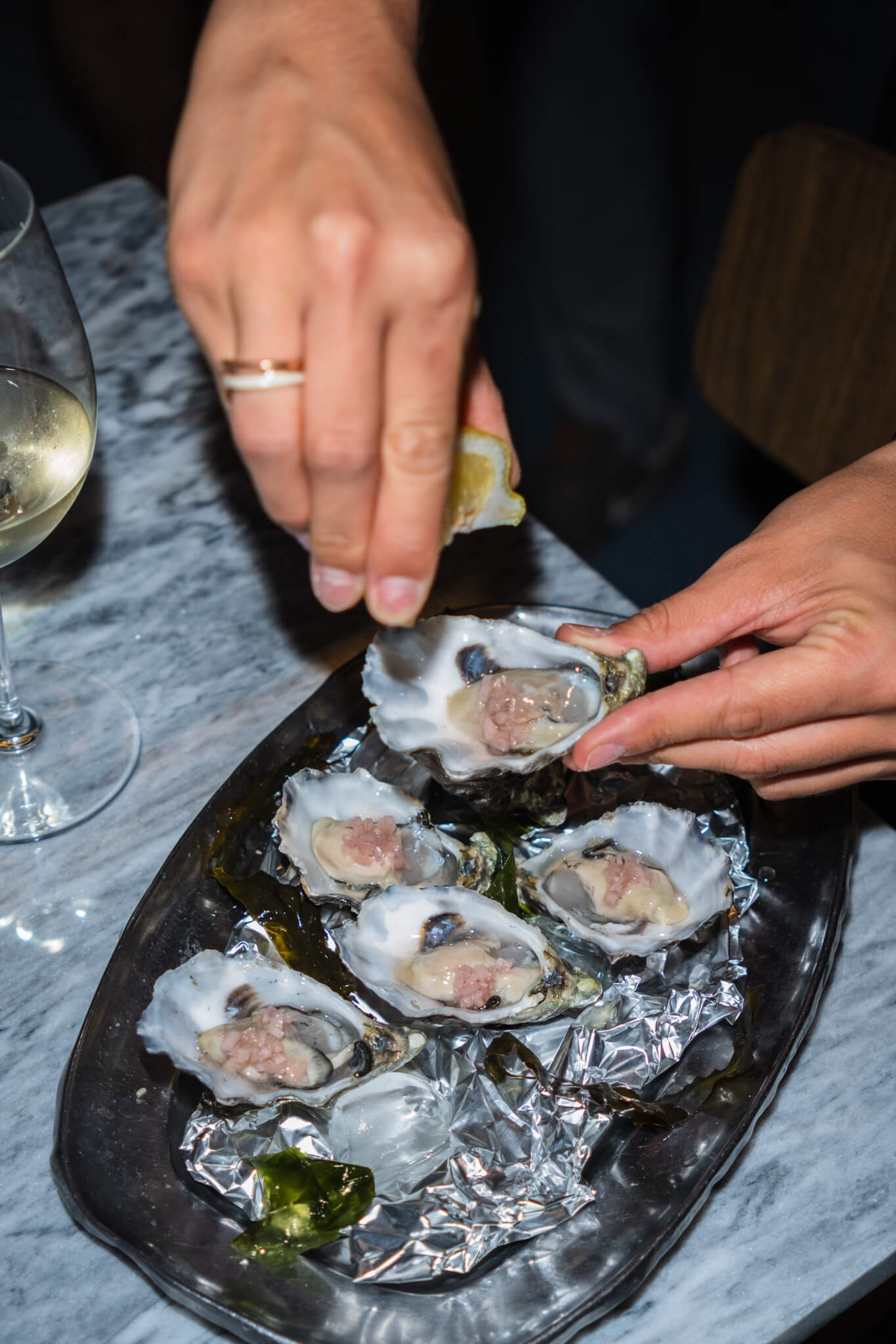
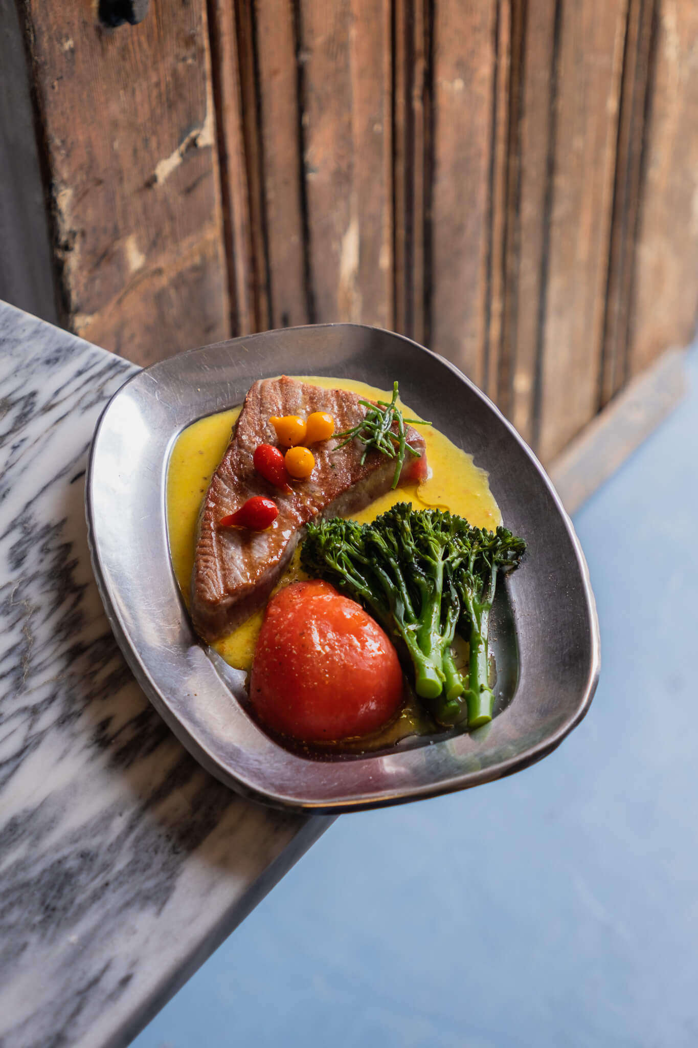
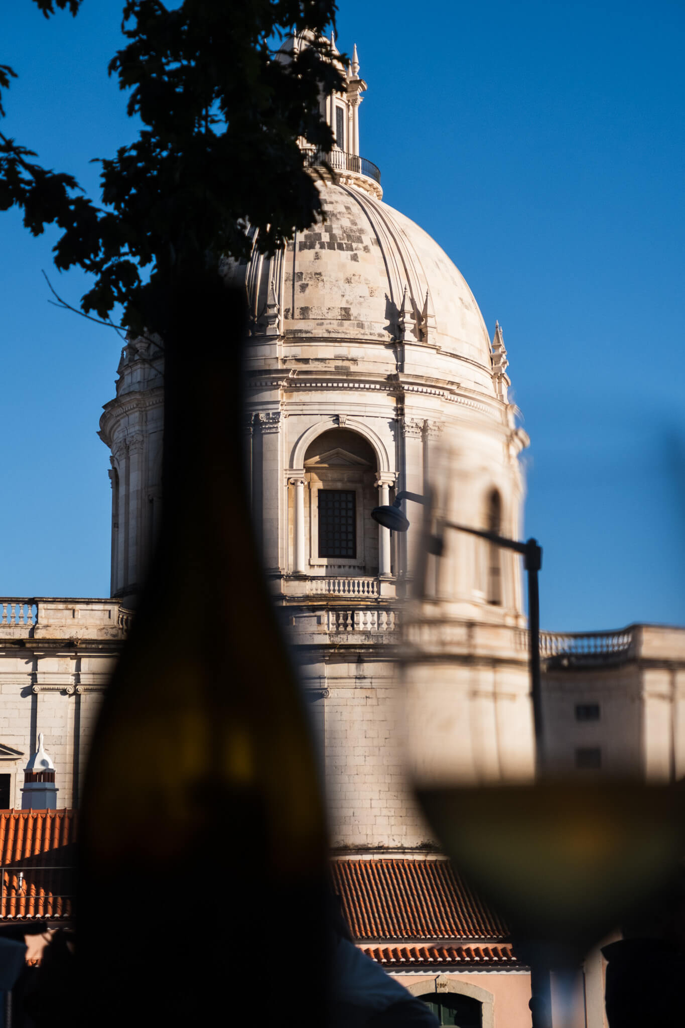
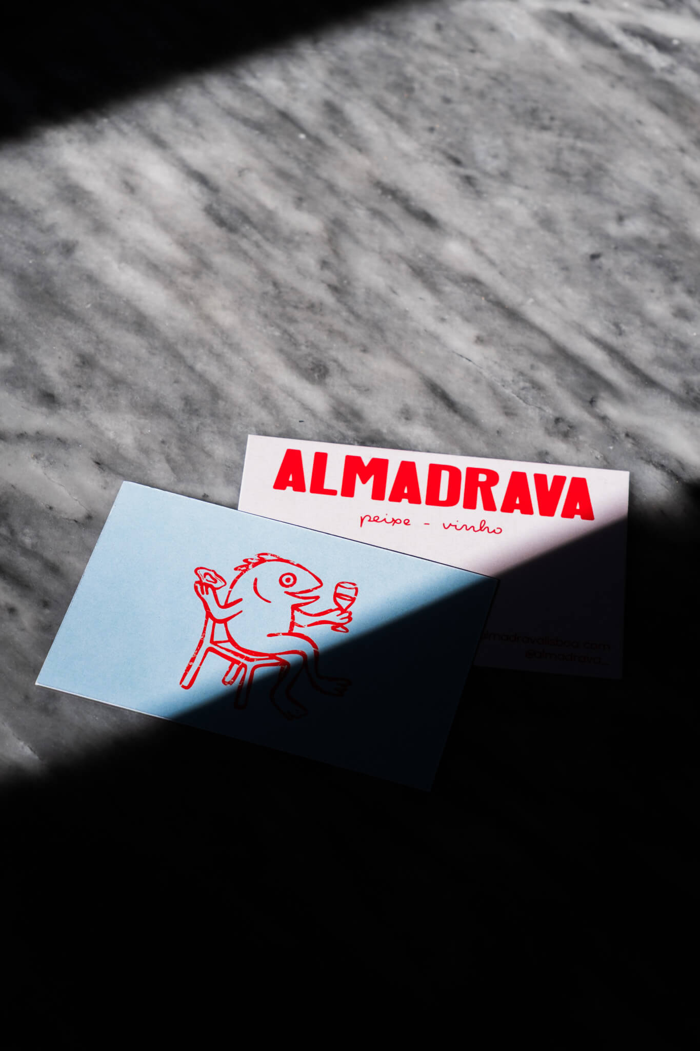
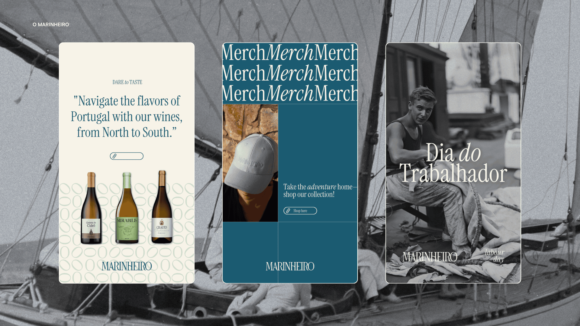
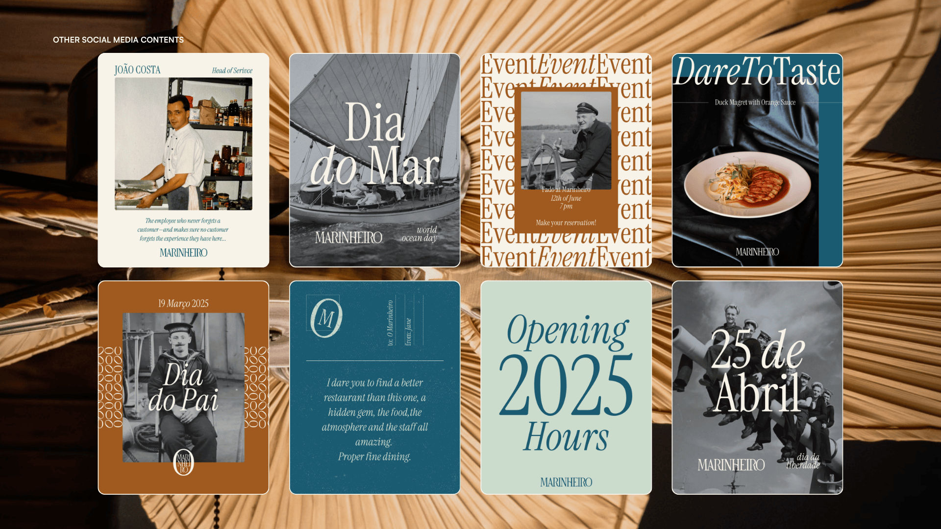
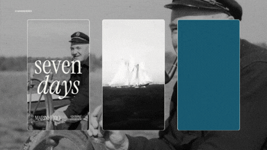
CHALLENGE
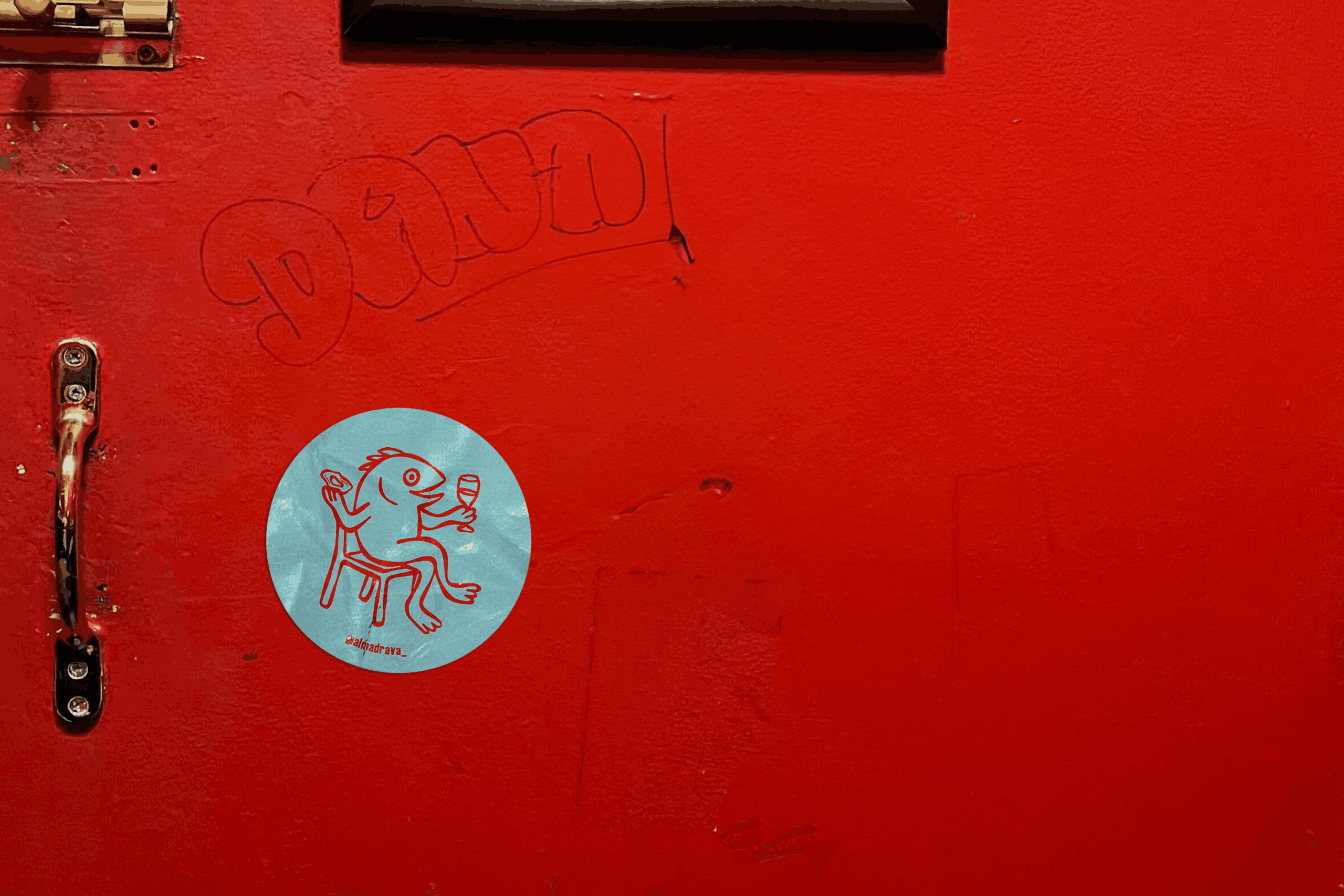
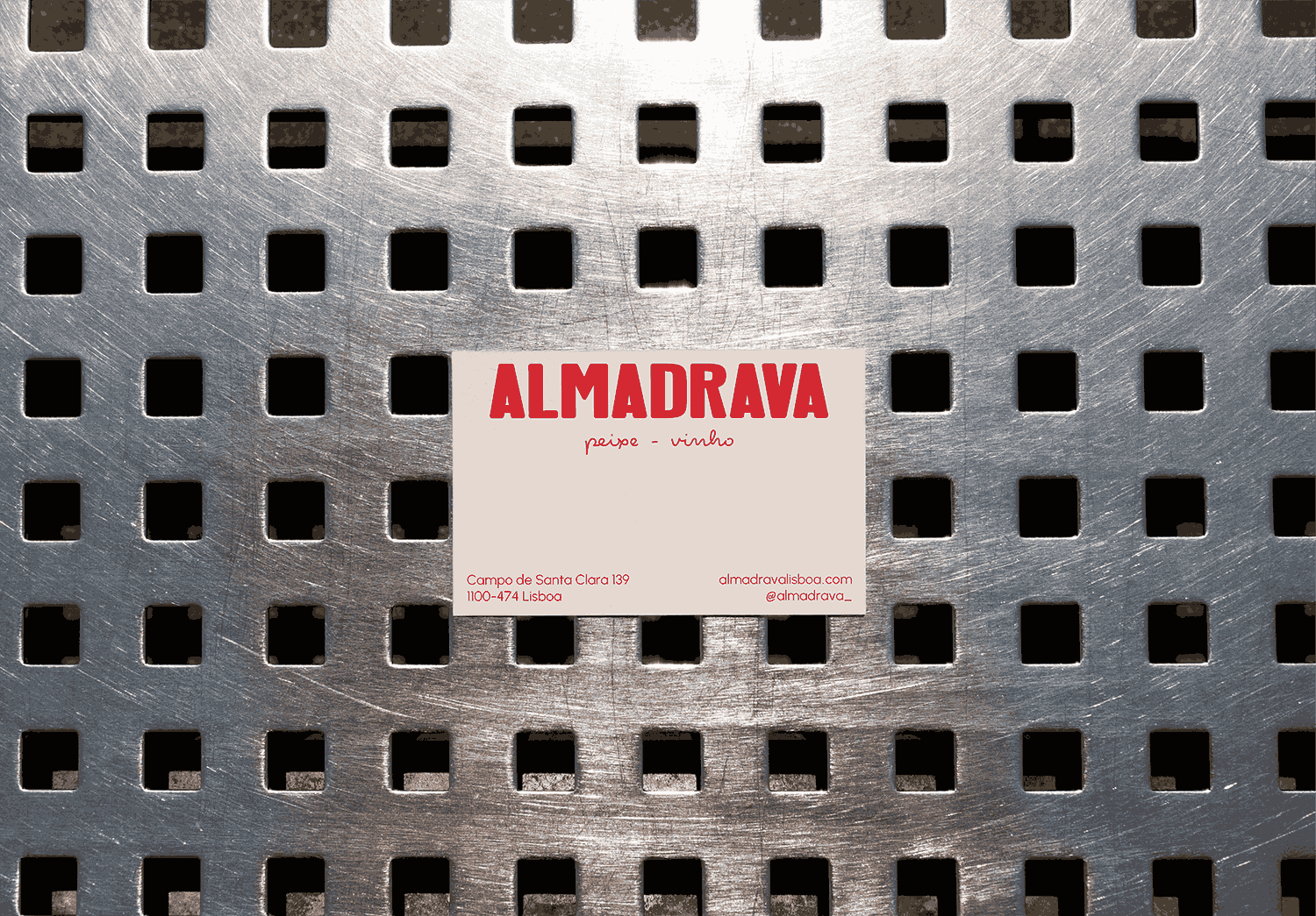
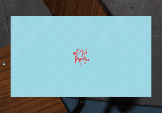
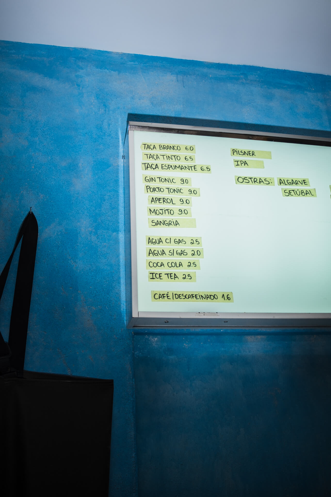
Almadrava is a fresh seafood and natural wine restaurant in Lisbon, set against stunning views near the Panteão. The challenge was to create a brand that felt young, approachable, and memorable while highlighting the quality of the food, the curated wine selection, and the restaurant’s unique location. The identity also needed to reflect the humour, laid-back spirit, and cosmopolitan energy that define Almadrava, positioning it as both a local hotspot and a wider cultural reference point in Lisbon’s modern dining scene.
APPROACH
The visual identity blends clean, contemporary design with playful, approachable touches. Art direction, branding, photography, and social media content work together to showcase fresh seafood, natural wine, and the vibrant atmosphere. Subtle nods to the restaurant’s Portuguese roots are combined with international design cues, reflecting its cosmopolitan spirit. The resulting brand is dynamic and versatile—inviting friends to gather, encouraging repeat engagement, and setting the tone for the neighbourhood while remaining authentic, humorous, and unforgettable.
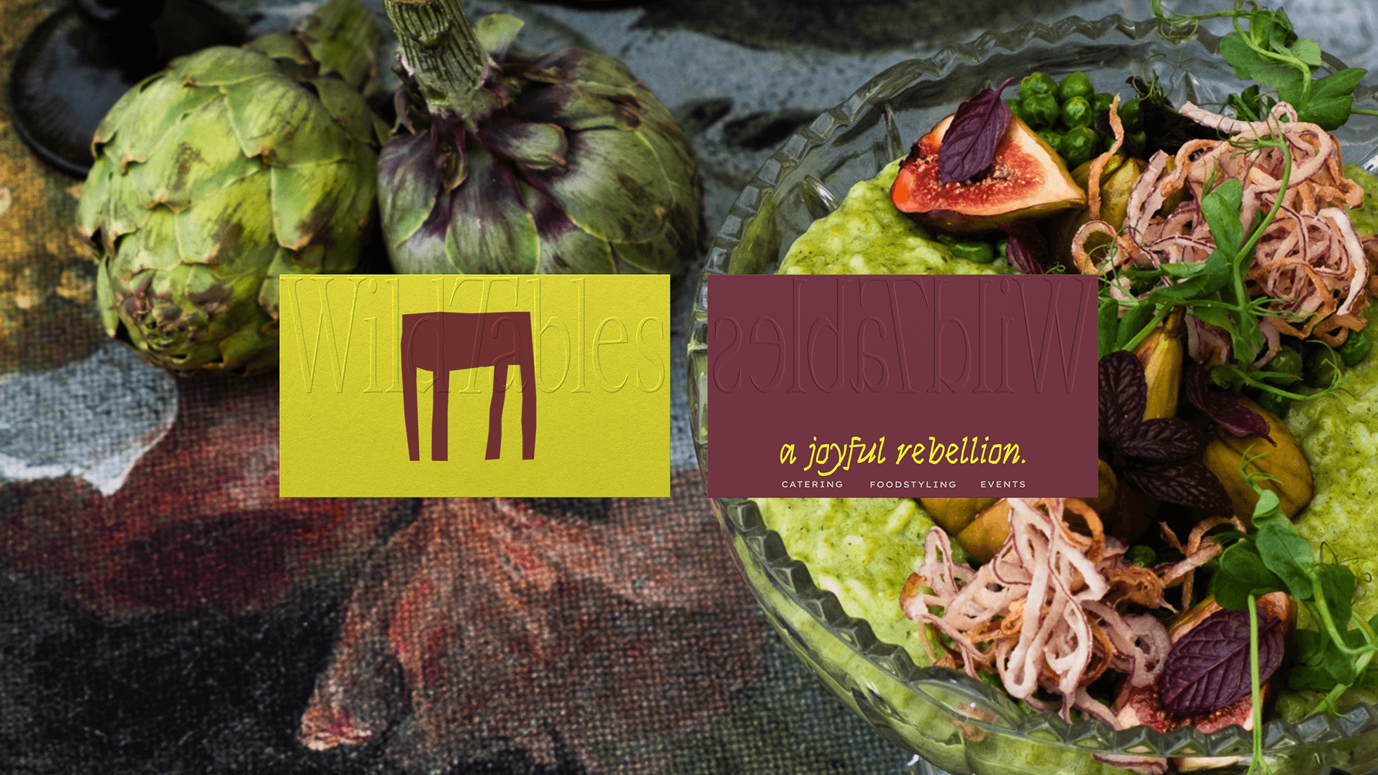
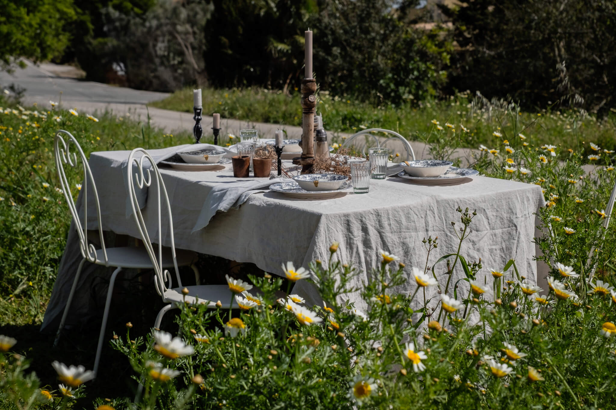
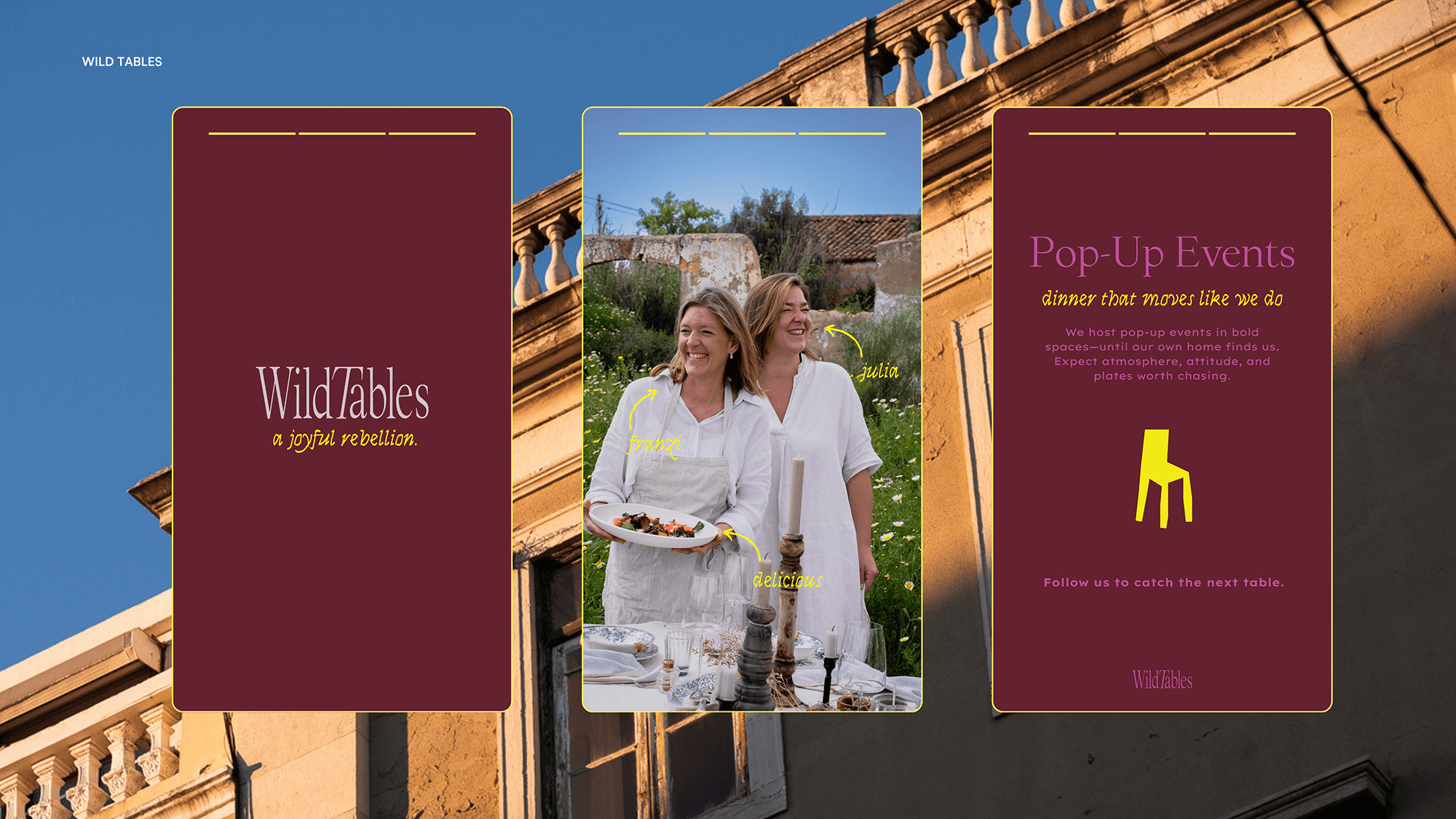
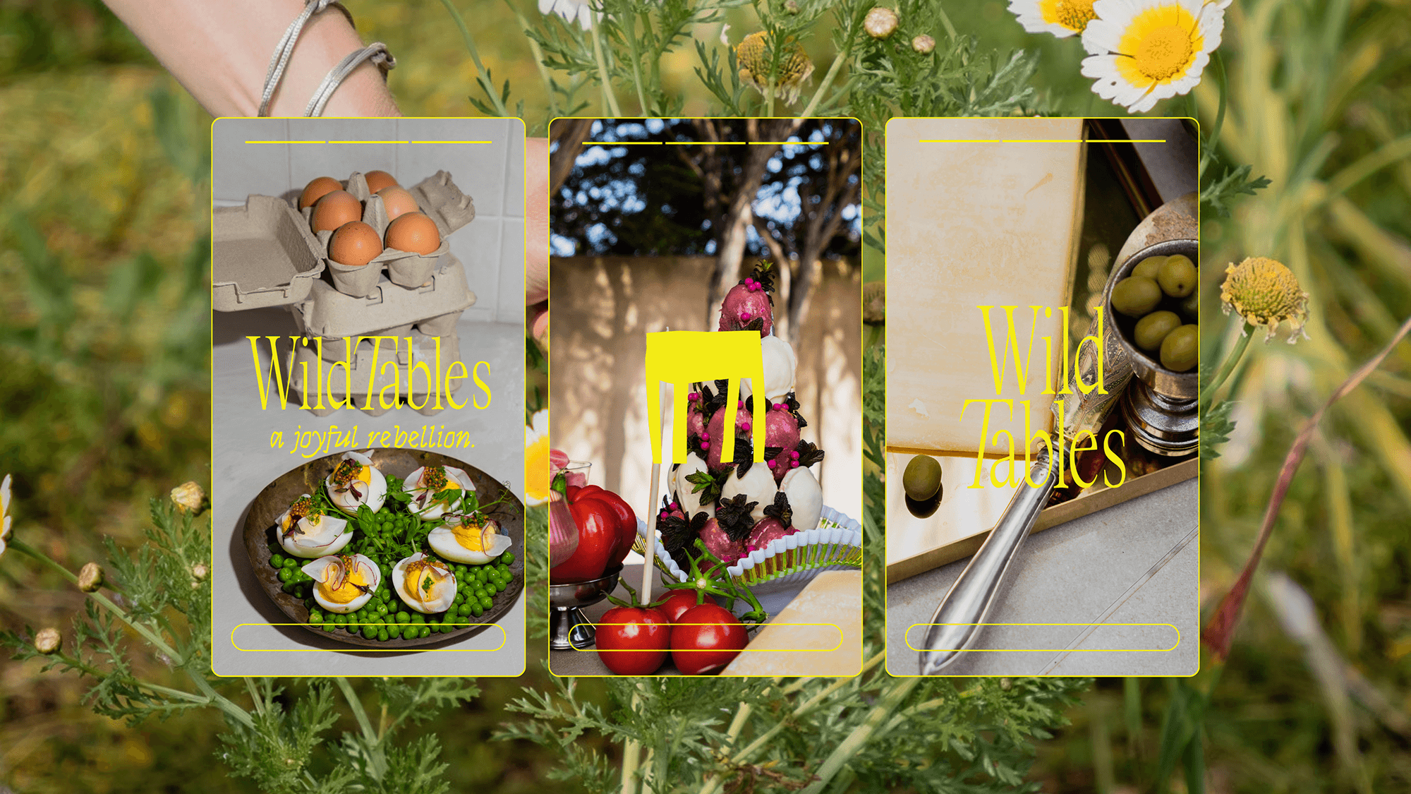
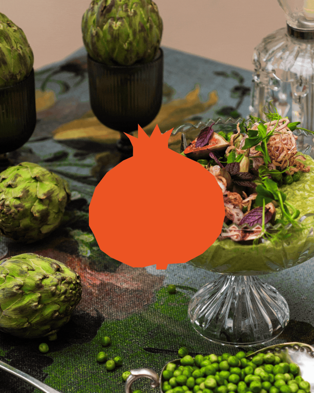
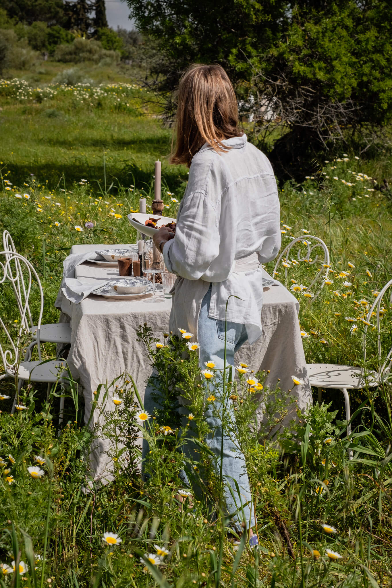
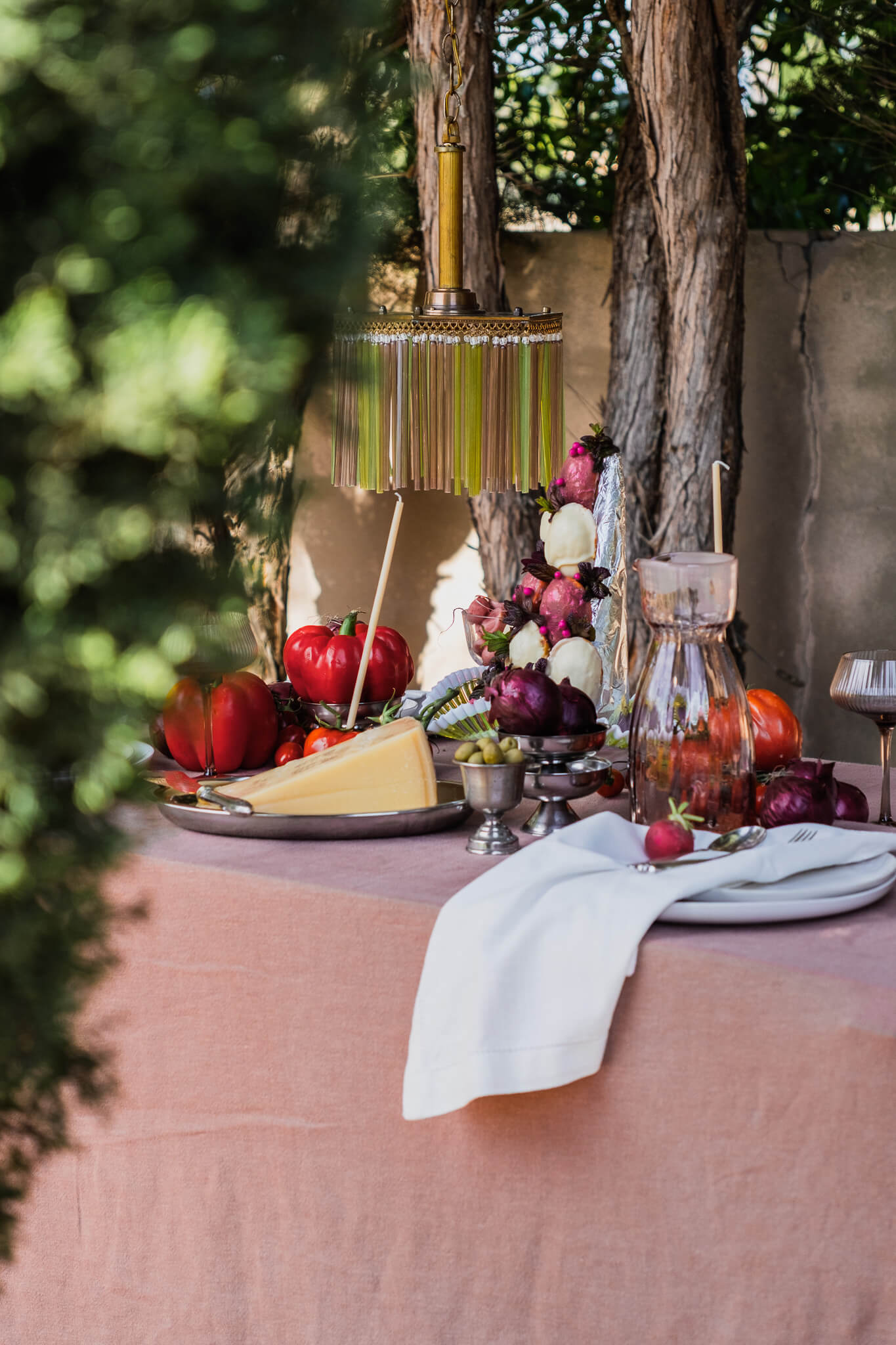
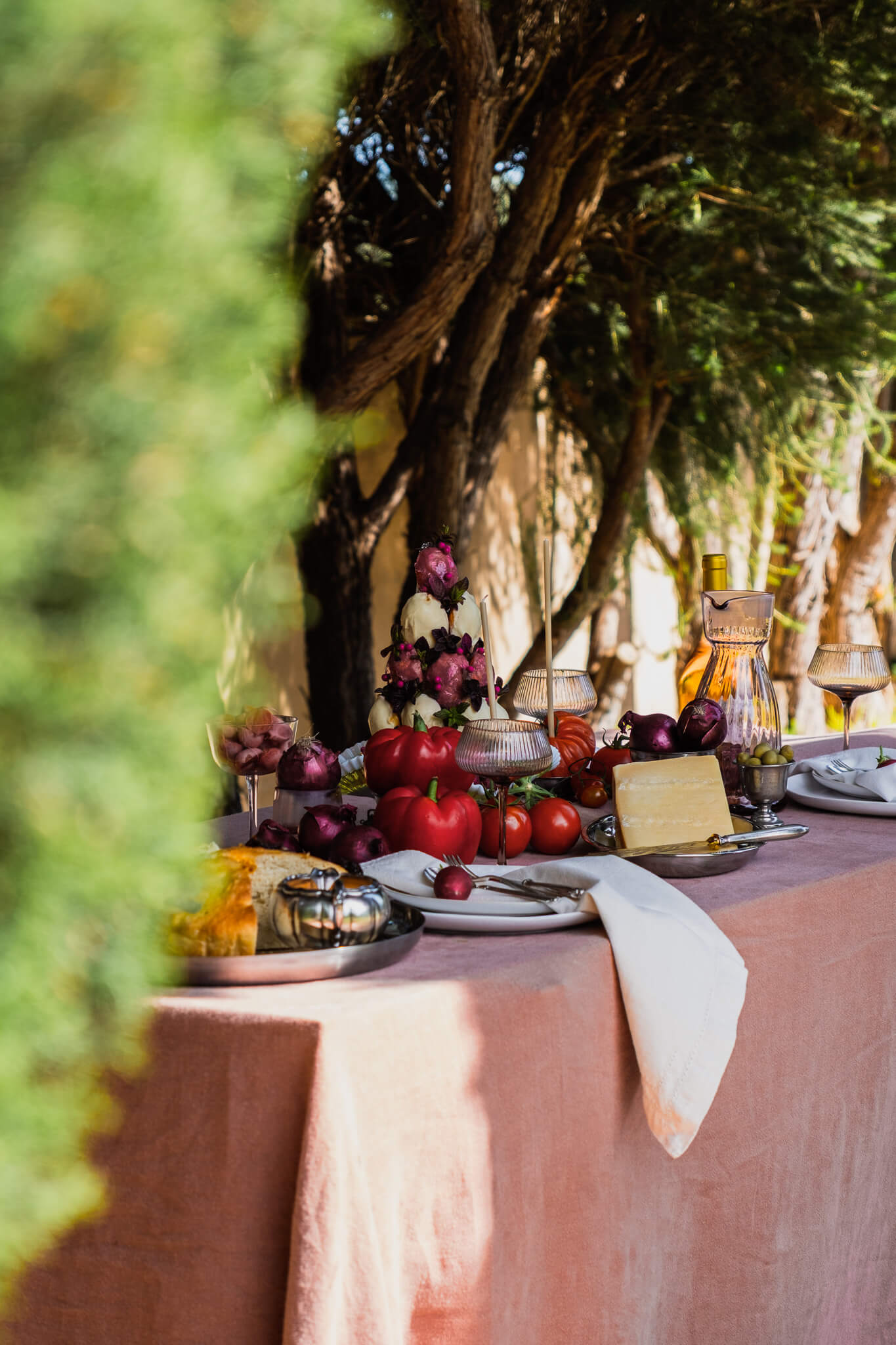
CHALLENGE
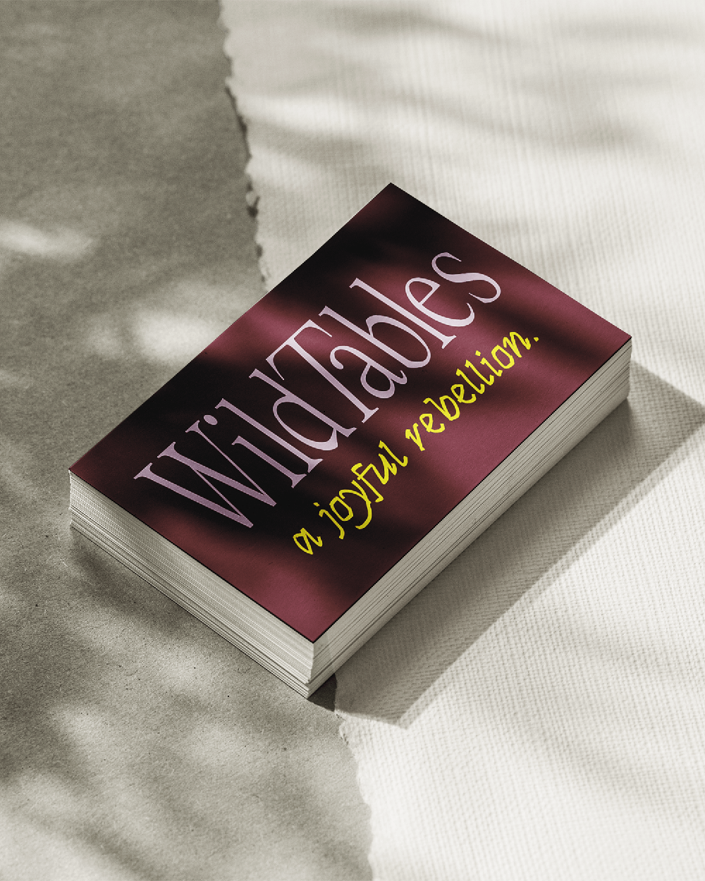
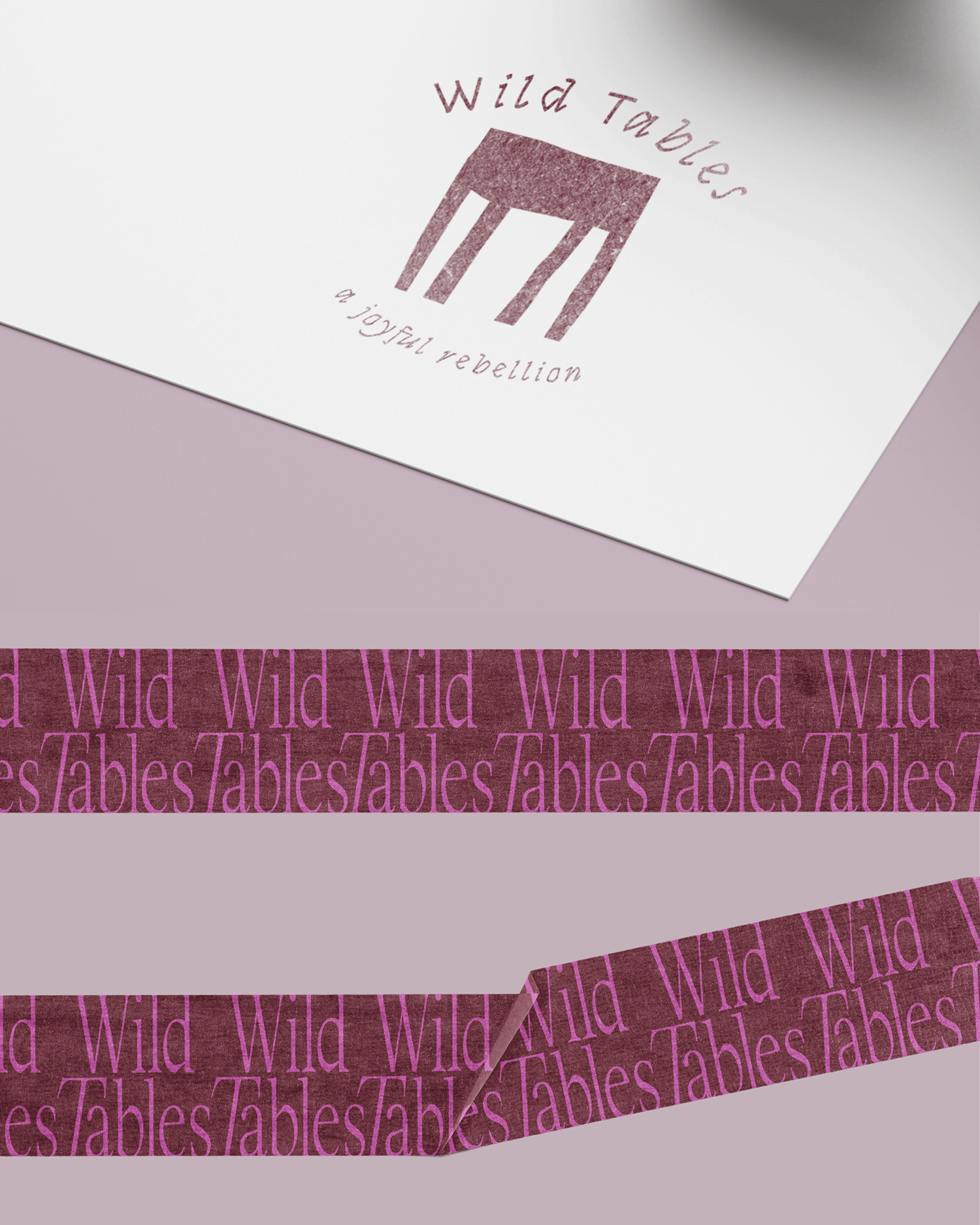
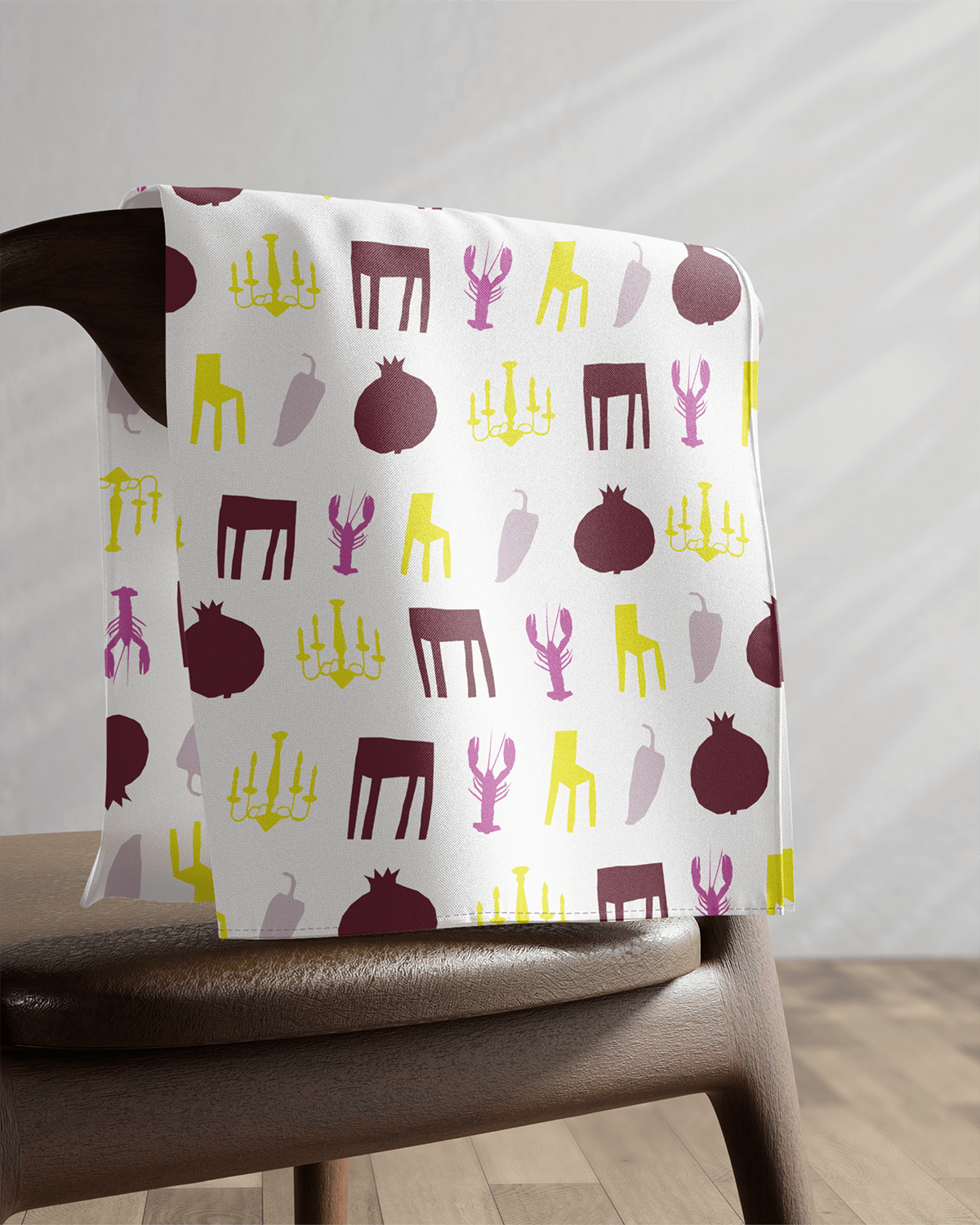
Wild Tables reimagines the idea of dining as a pop-up restaurant set wherever you choose—at home, in a garden, or in unexpected spaces. The challenge was to translate this immersive, sensory concept into a brand identity that feels intimate yet bold. It needed to capture creative cuisine, lush aesthetics, and a sense of playful opulence, while appealing to a conscious, design-driven audience looking for something beyond a traditional catering service.
APPROACH
The visual world embraces contrast: refined yet expressive, elegant yet slightly rebellious. Rich tones, layered compositions, and confident typography reflect bold table settings, deep flavors, and the atmosphere of music-filled gatherings. The identity positions Wild Tables not simply as catering, but as a curated experience—personal, atmospheric, and memorable. A brand designed to invite curiosity and turn any setting into a full sensory moment.

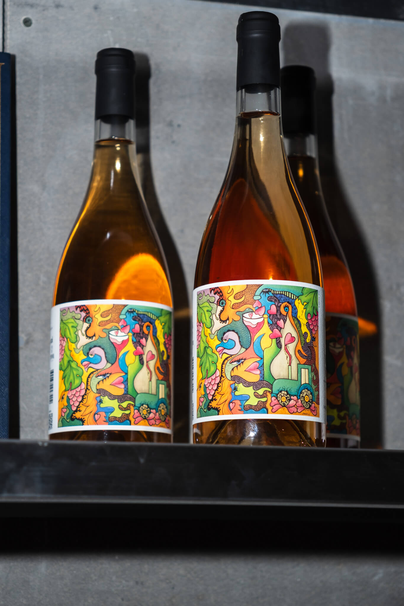
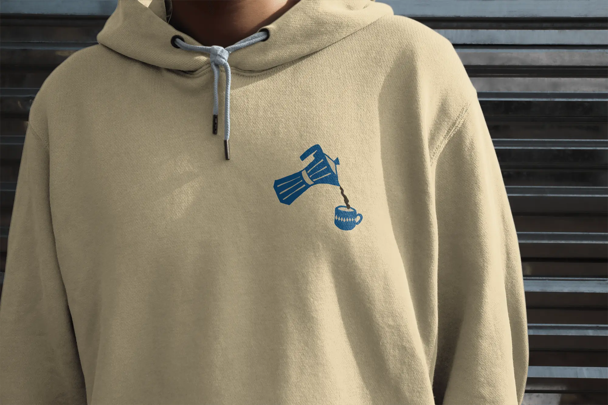
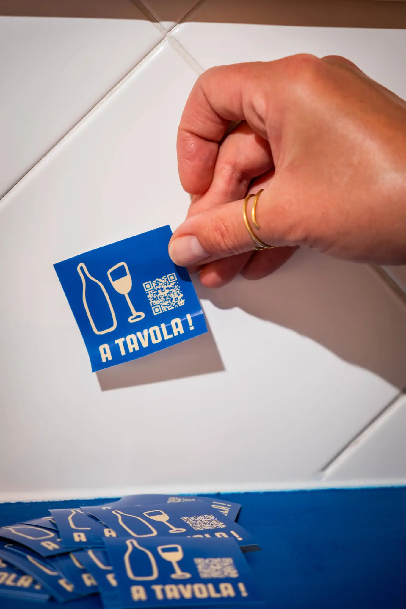
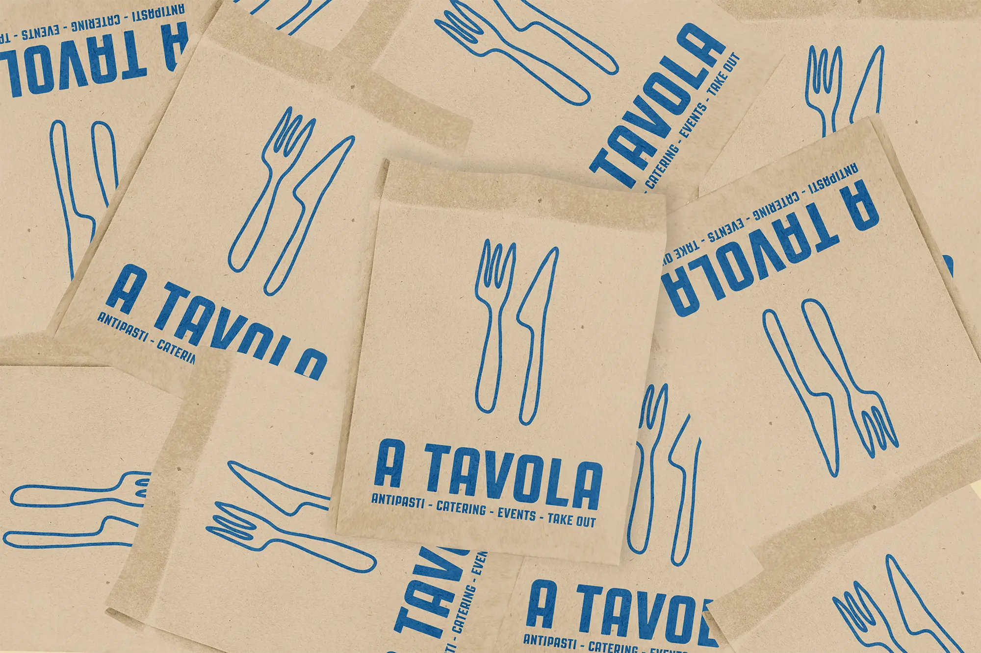
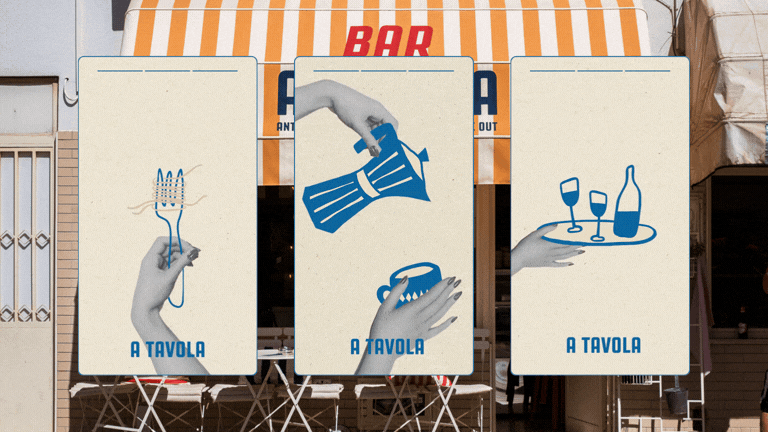
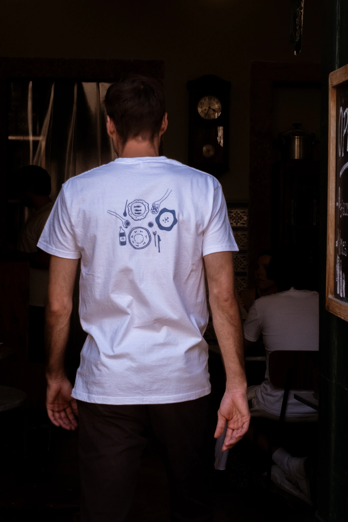
CHALLENGE
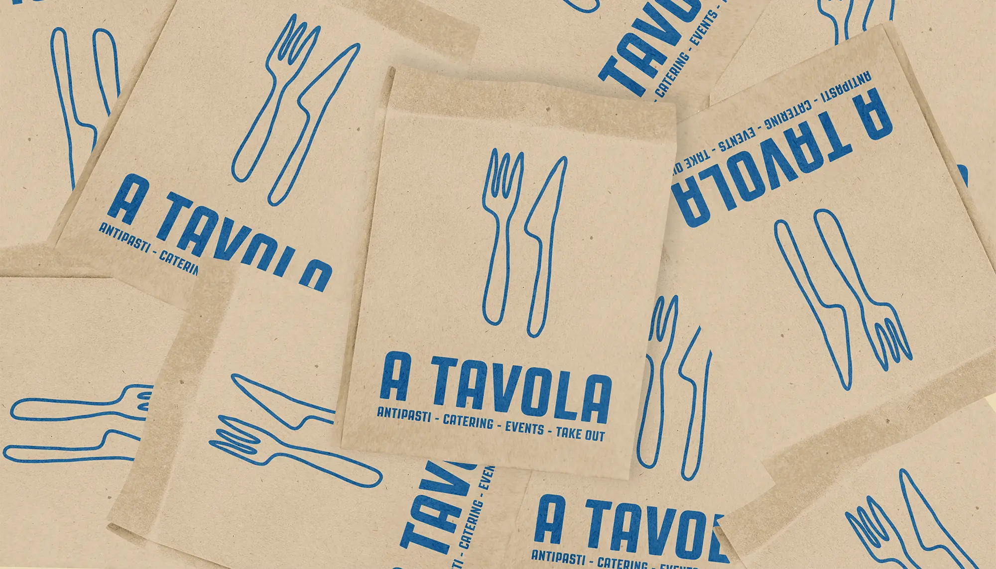
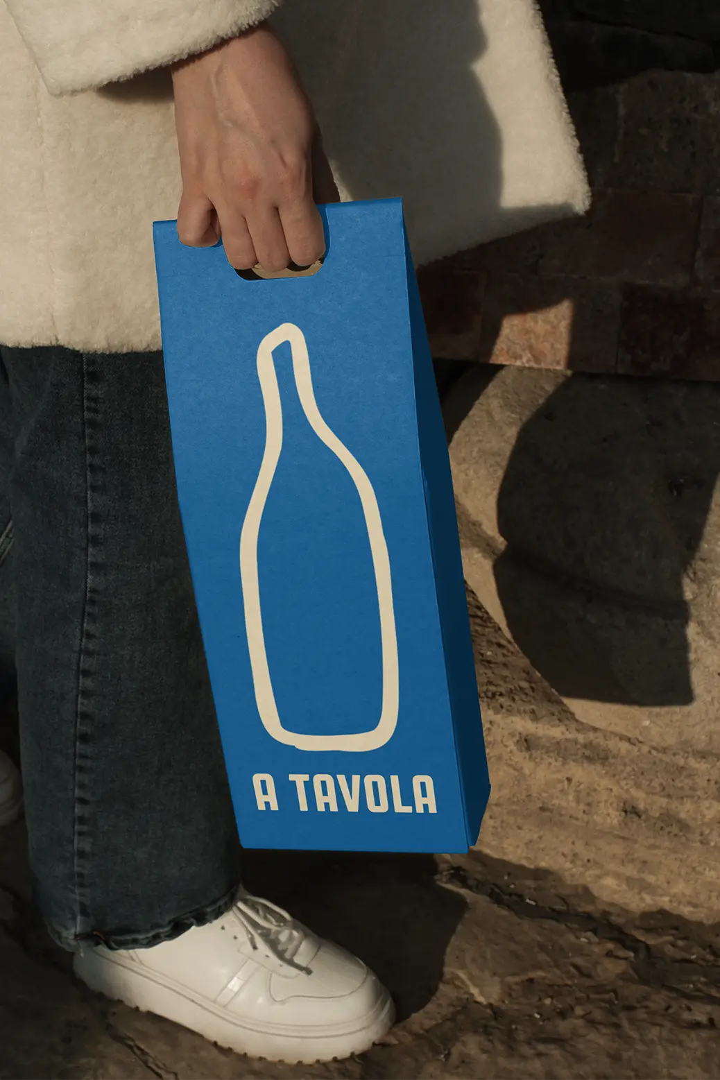
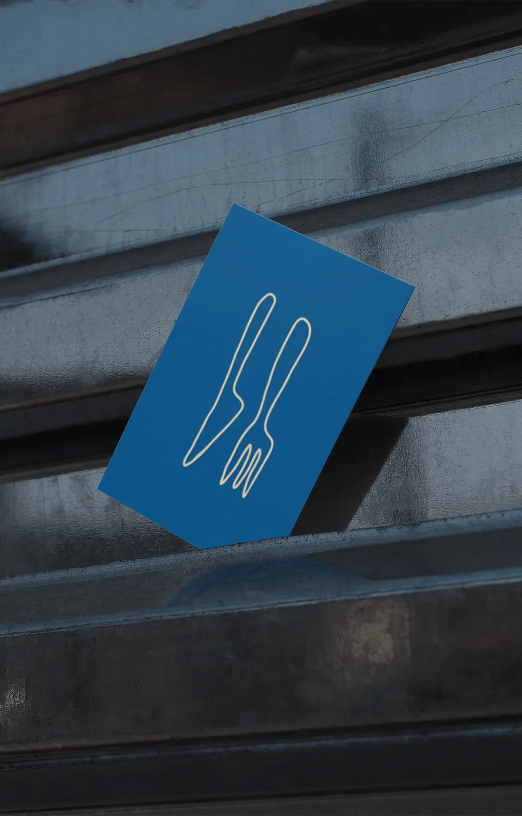
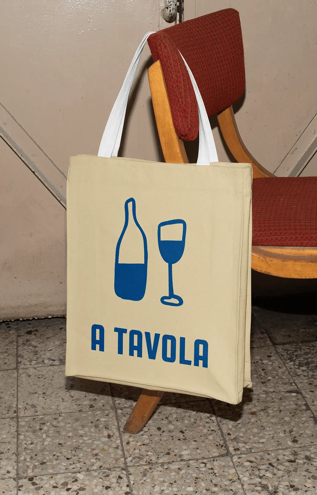
A Tavola is a vibrant, laid-back Italian bar in Algarve, Portugal, focused on uniting people through food and community. The challenge was to create a playful, hand-drawn aesthetic that remained cohesive and professional, balancing whimsy with modern appeal.
APPROACH
A Tavola is a vibrant, laid-back Italian bar in Algarve, Portugal, focused on uniting people through food and community. The challenge was to create a playful, hand-drawn aesthetic that remained cohesive and professional, balancing whimsy with modern appeal.
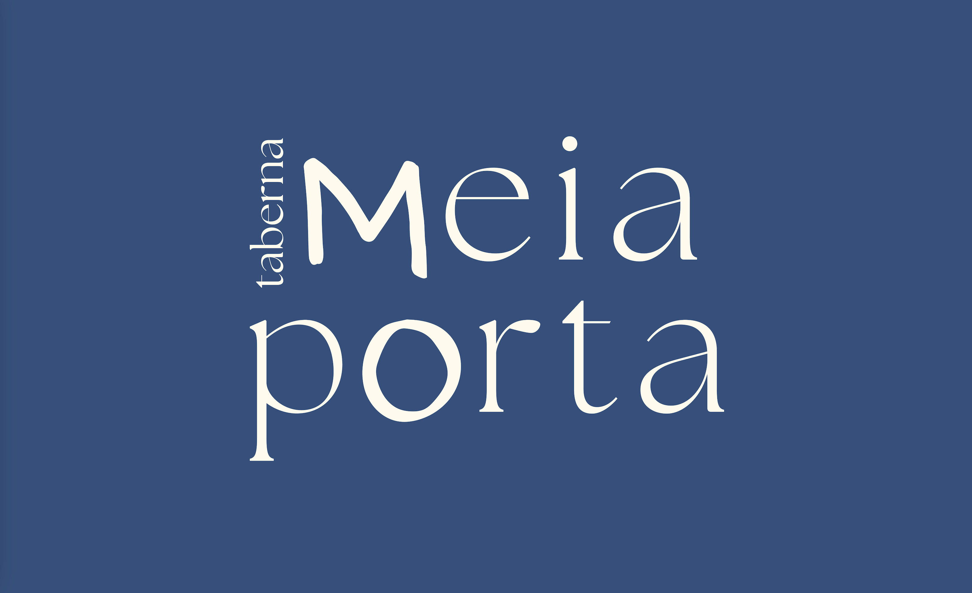
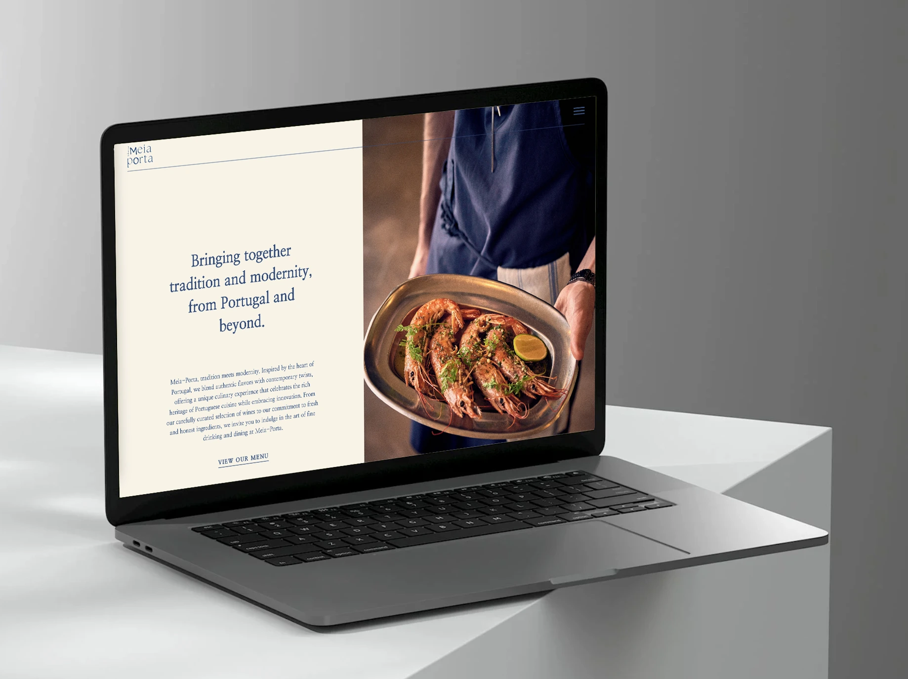
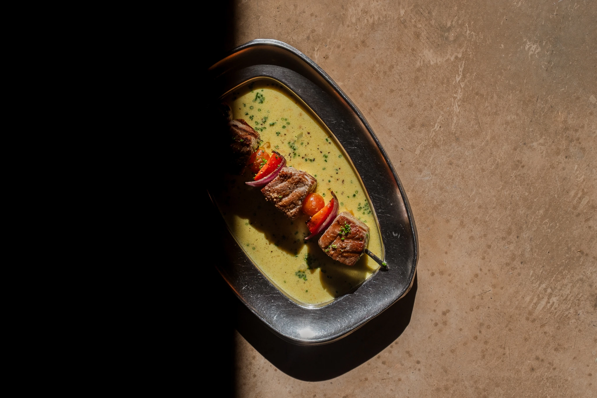
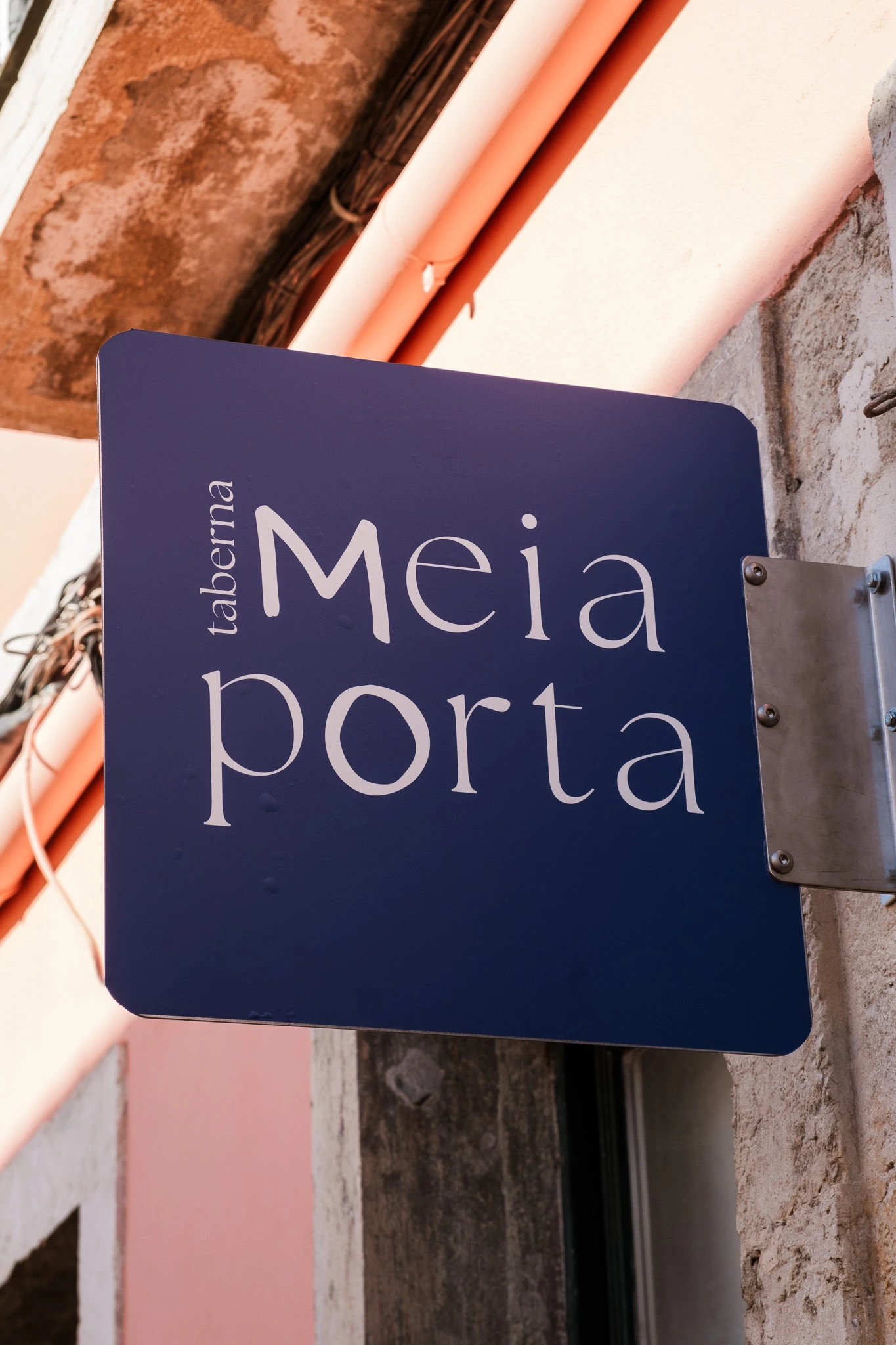
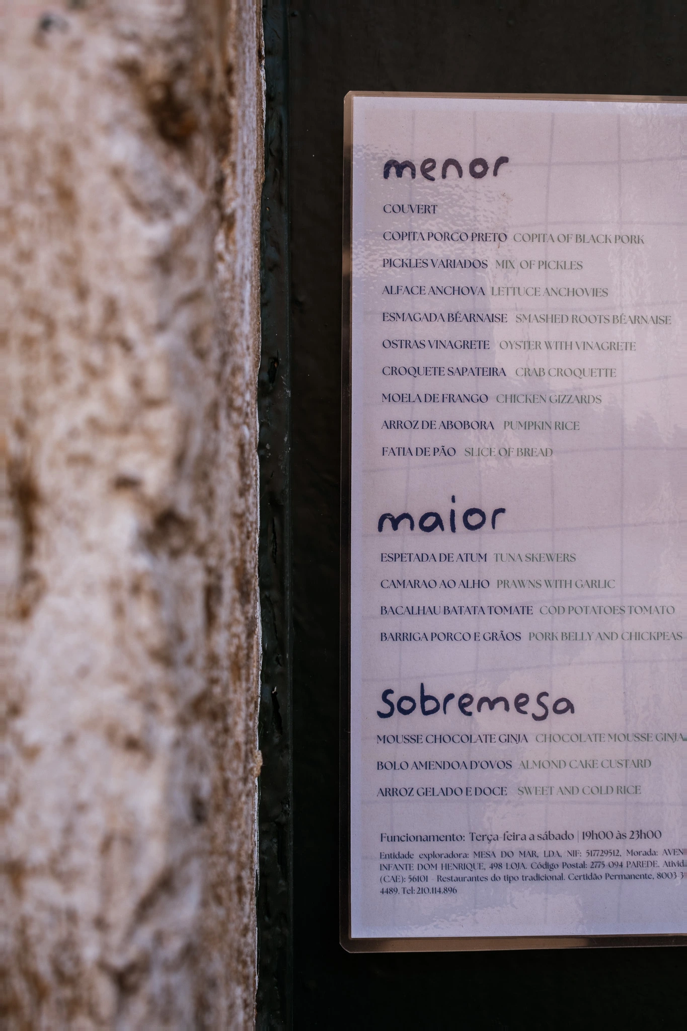
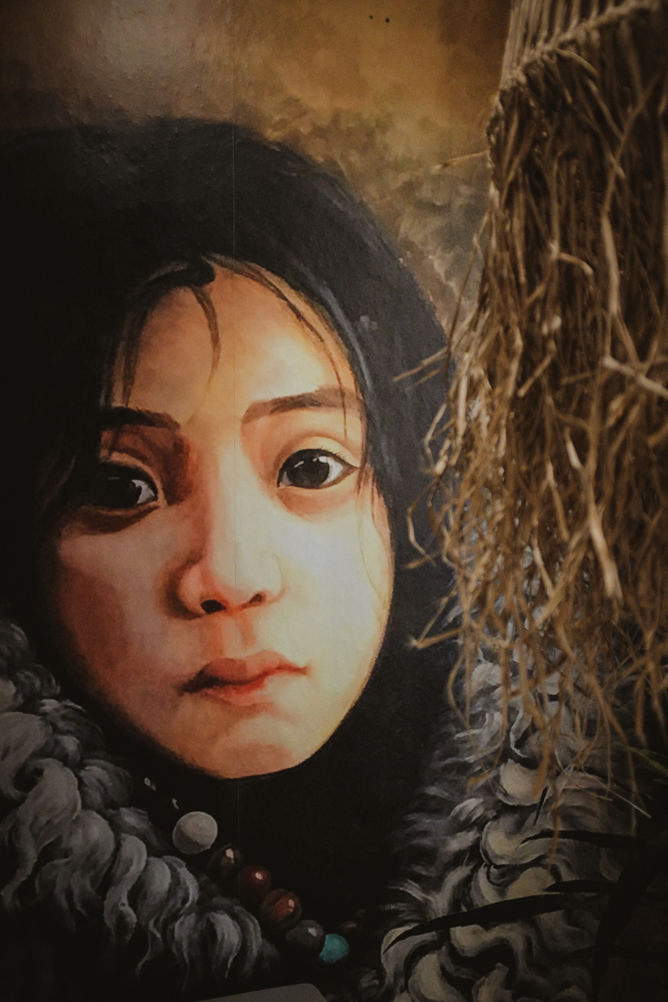
CHALLENGE
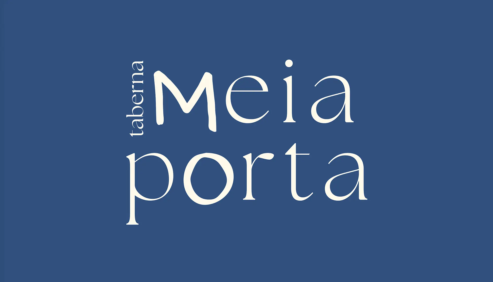
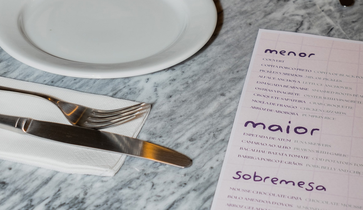
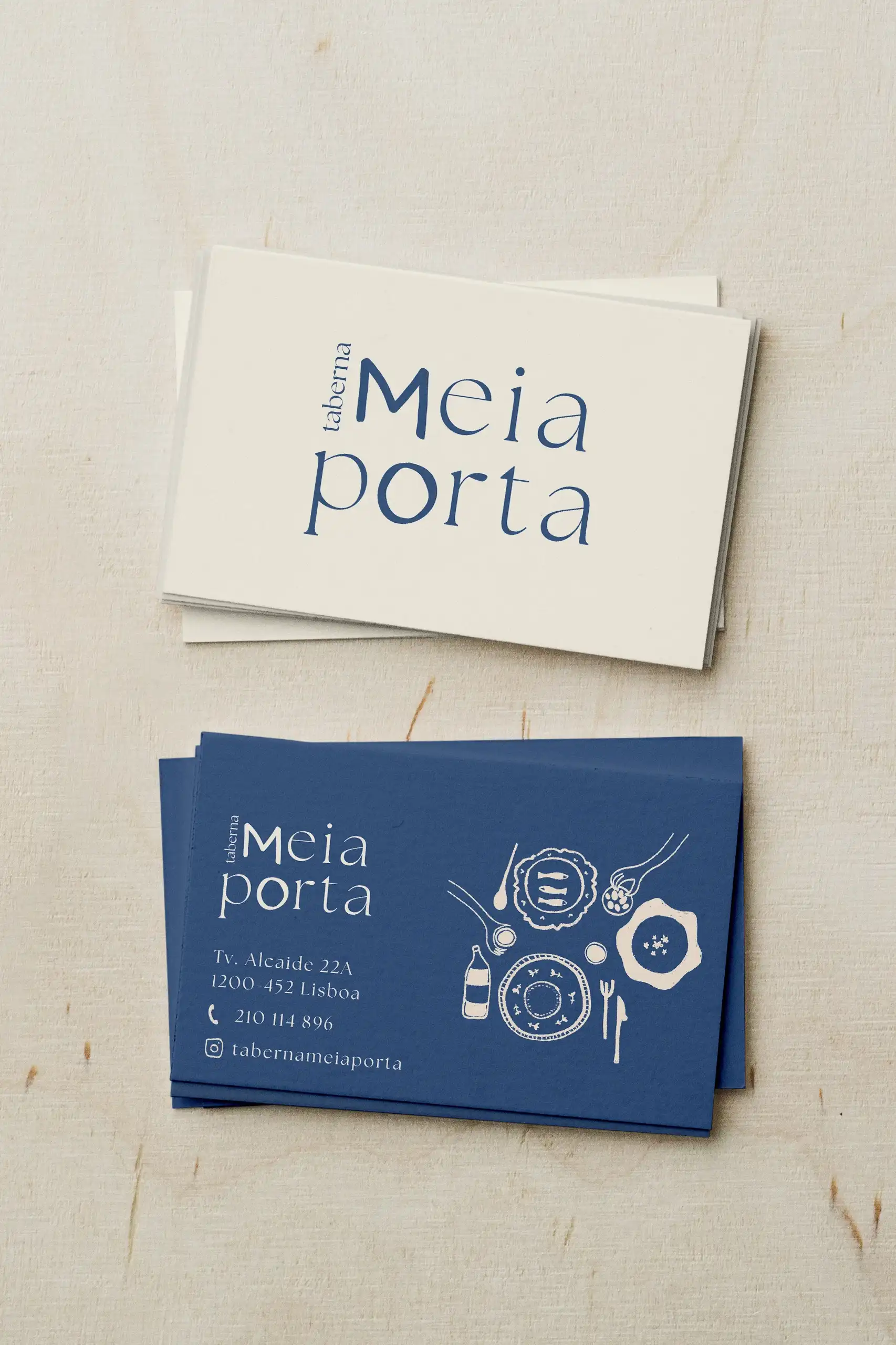
Meia-Porta stands at the intersection of heritage and reinvention. The challenge was to create a visual identity that honored the depth and authenticity of Portuguese culinary tradition while introducing a contemporary perspective. It needed to feel rooted in culture without appearing nostalgic, and modern without losing its sense of soul. Striking that balance between refinement and warmth was central to the project.
APPROACH
The identity draws inspiration from the vivid blue of traditional Portuguese azulejos, echoing both cultural heritage and the relaxed rhythm of everyday life. The wordmark combines an elegant serif typeface with hand-drawn lettering, blending structure with spontaneity. This contrast reflects the brand’s essence: a thoughtful fusion of tradition and creativity, where classic flavors meet a fresh, modern expression.
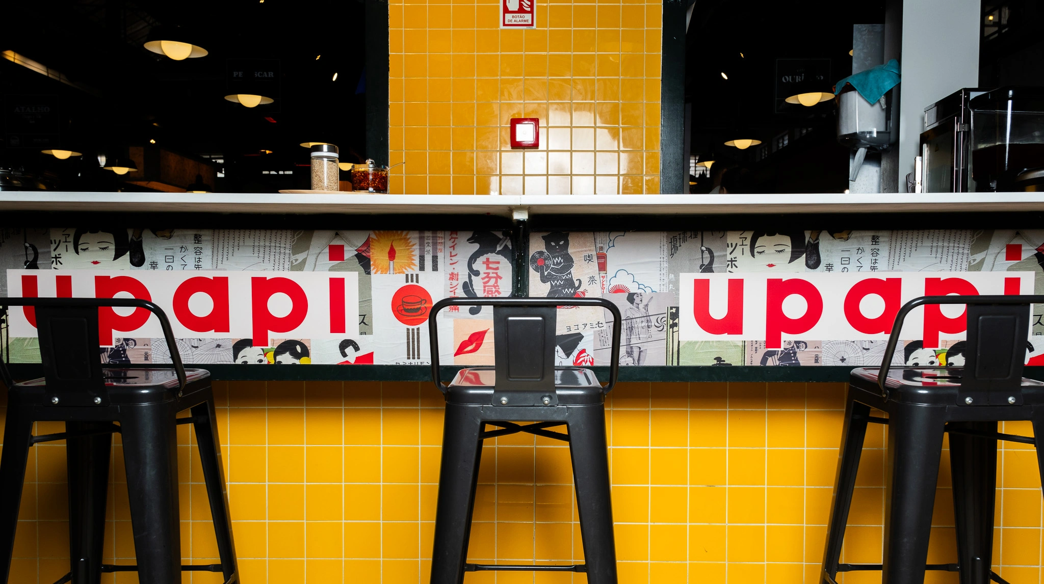
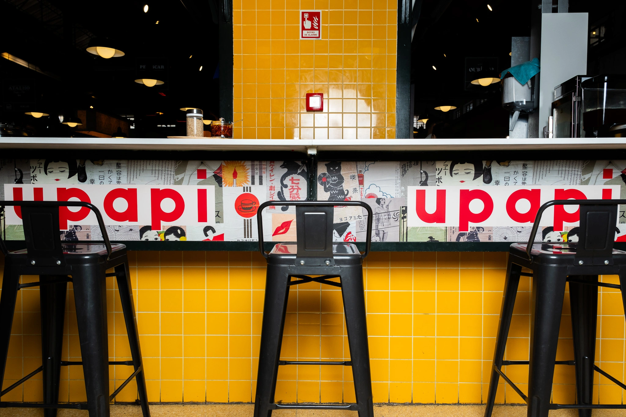
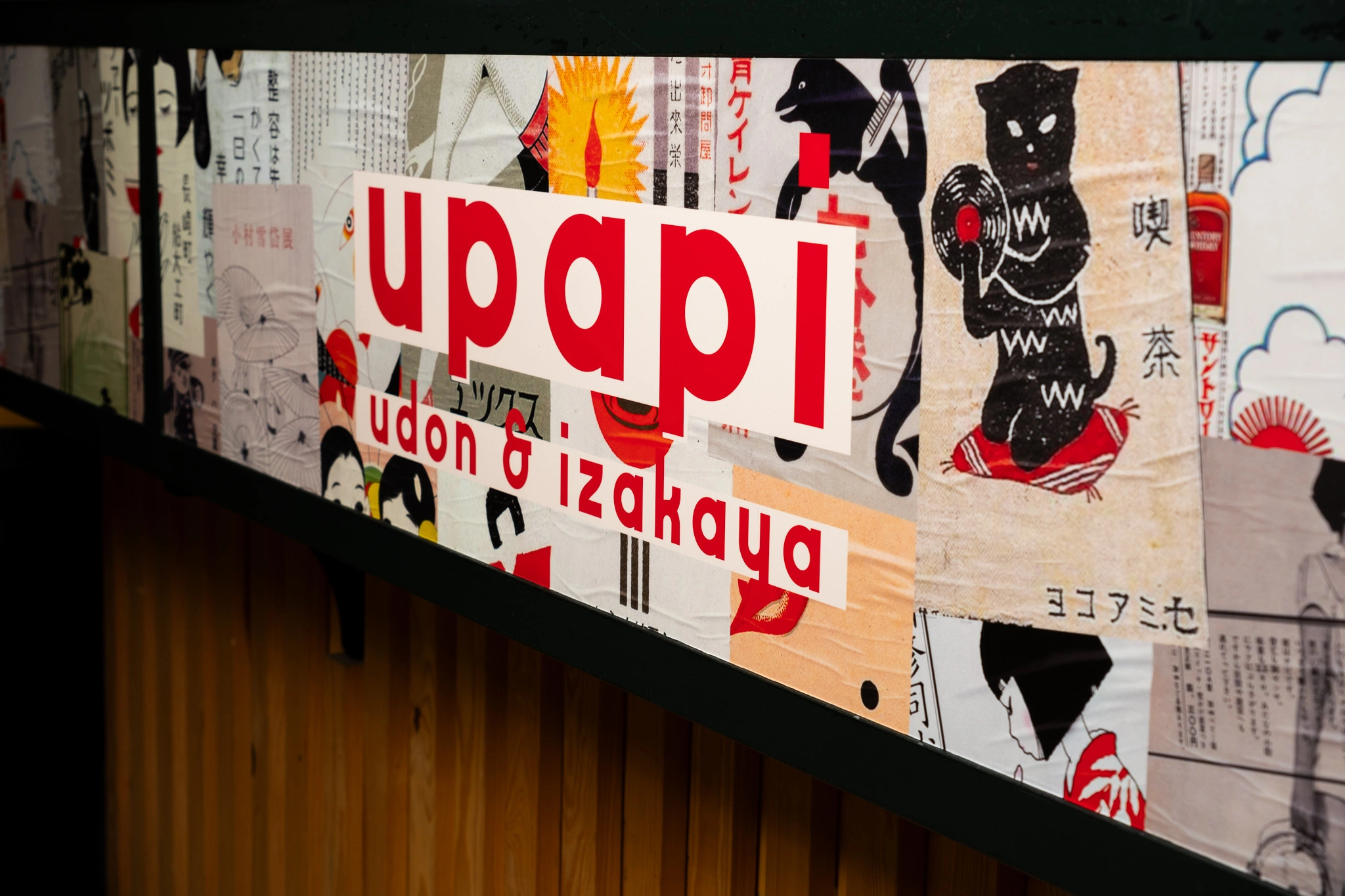
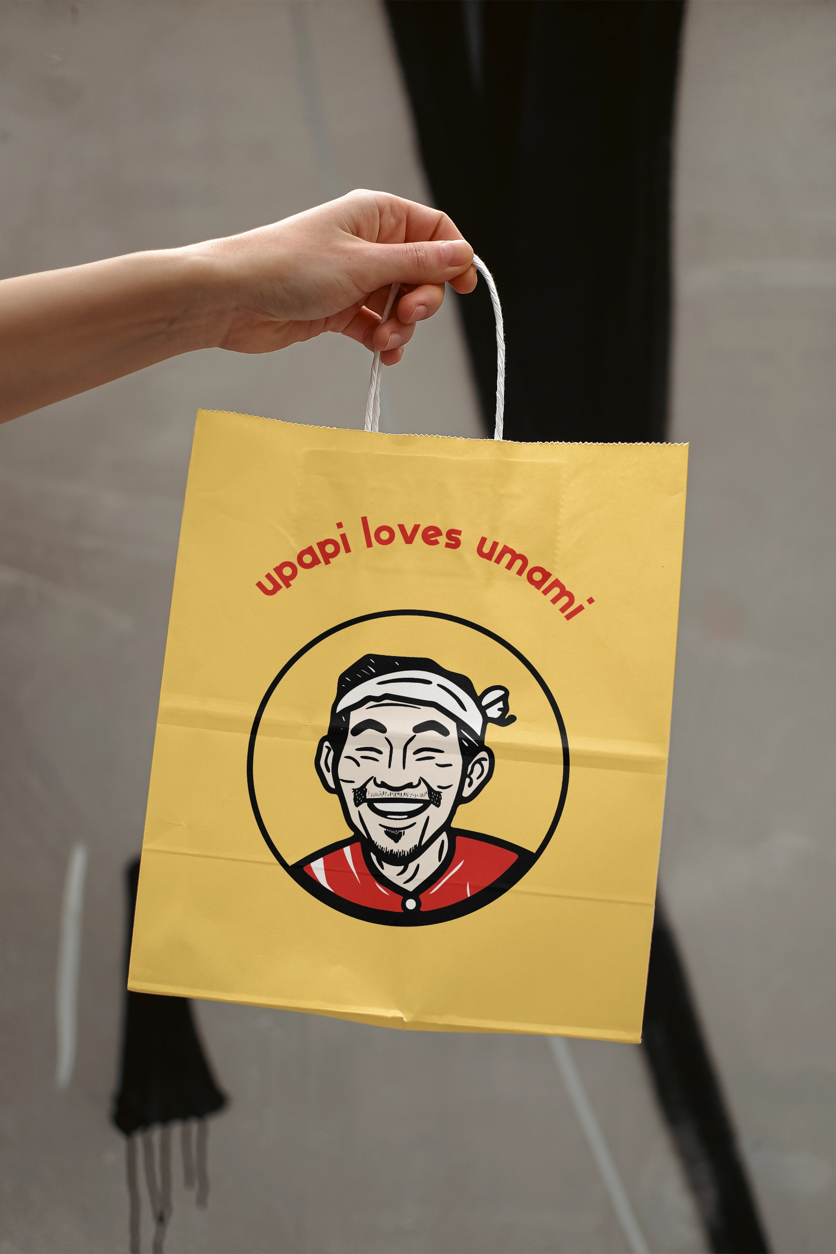
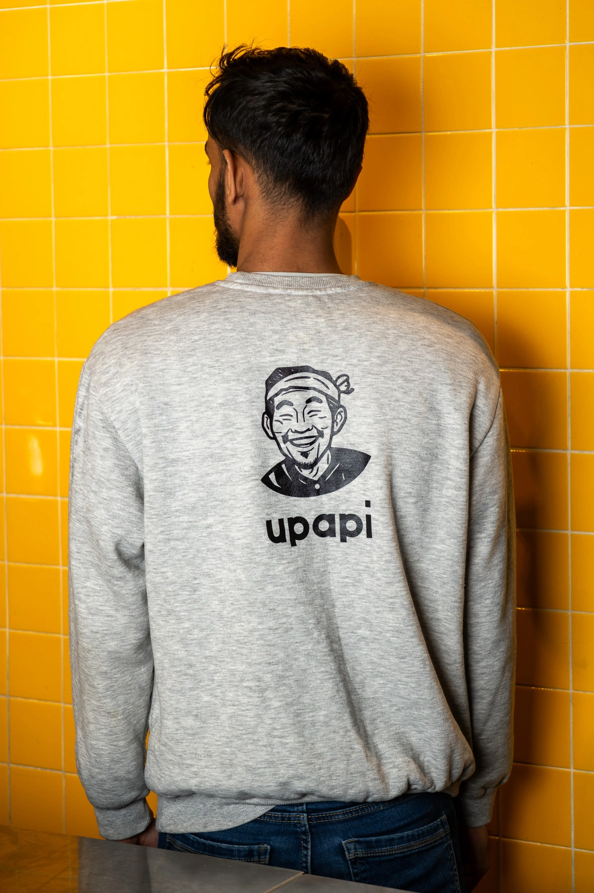
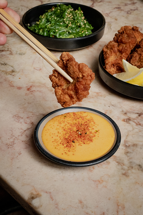
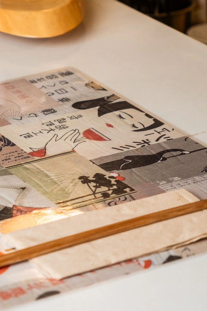
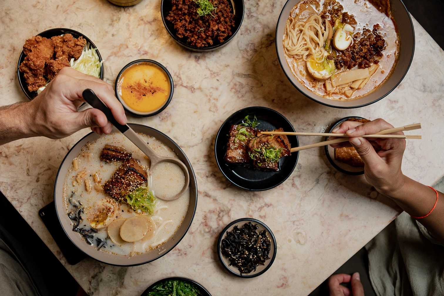
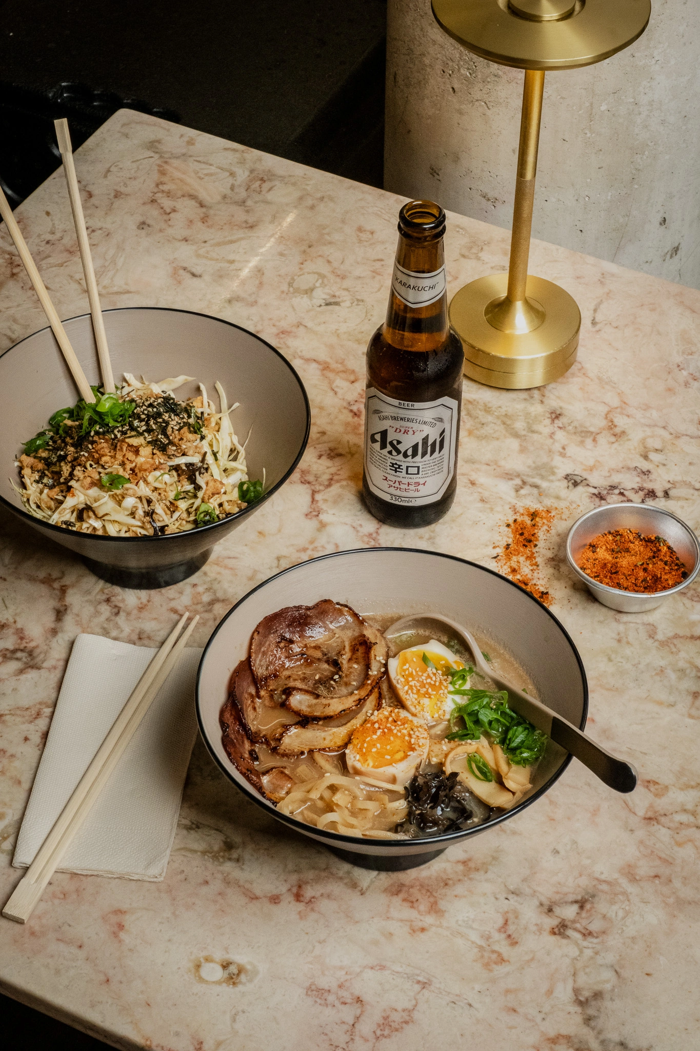
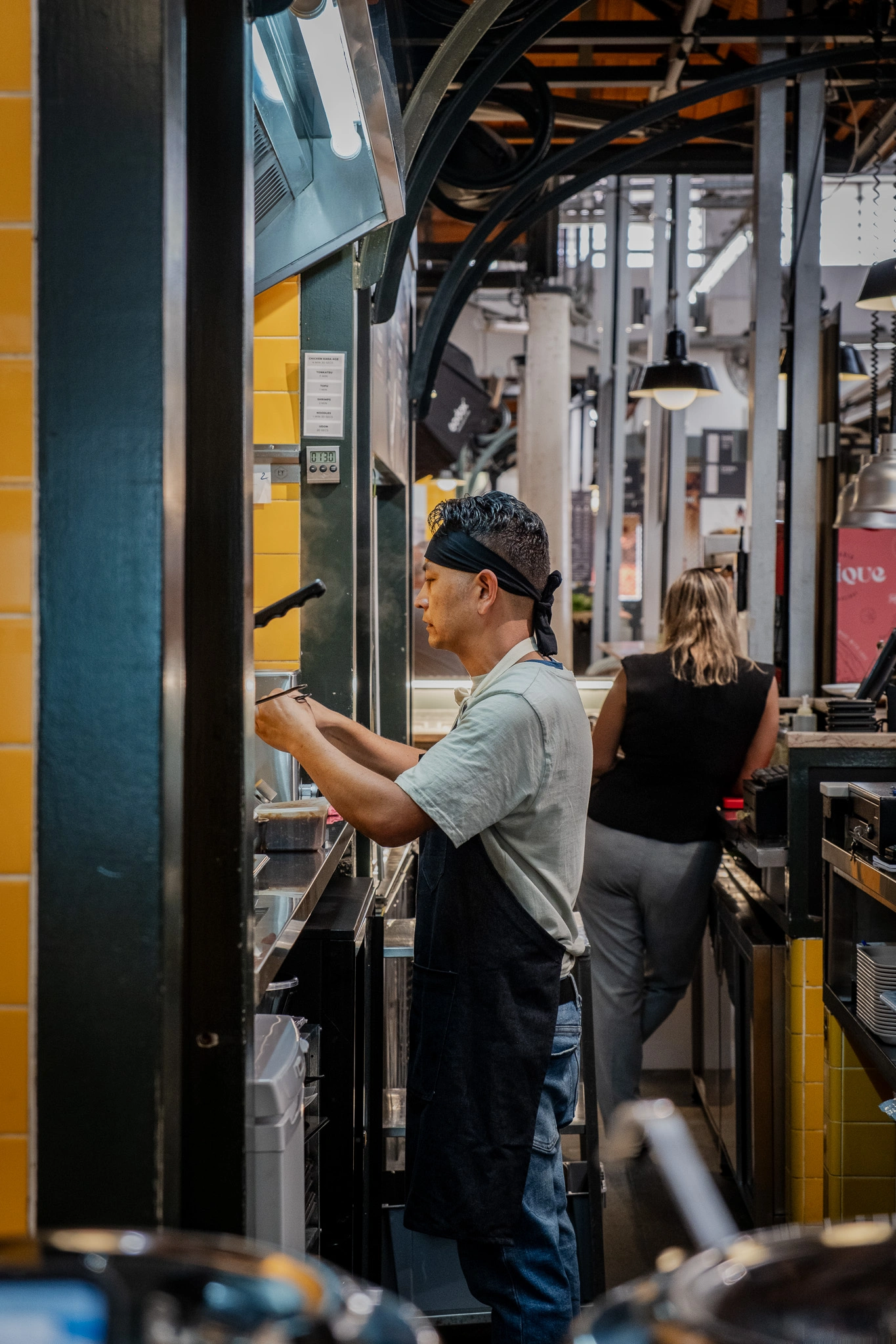
CHALLENGE
Upapi is a Japanese udon spot located in Lisbon’s Mercado de Campo de Ourique, aimed at bringing a youthful perspective to a traditional dining experience. The challenge was to merge recognizable Japanese visual heritage with a clean, contemporary aesthetic—without losing authenticity or approachability. The identity needed to respect cultural roots while appealing to a modern, urban audience.
APPROACH
The concept draws on vintage Japanese matchbox labels, introducing character, nostalgia, and subtle playfulness into the visual language. These expressive elements were paired with modern typography and structured layouts to create clarity and balance. By blending tradition with minimal, contemporary design cues, the final identity feels both genuine and current—capturing cultural depth while remaining accessible and fresh.

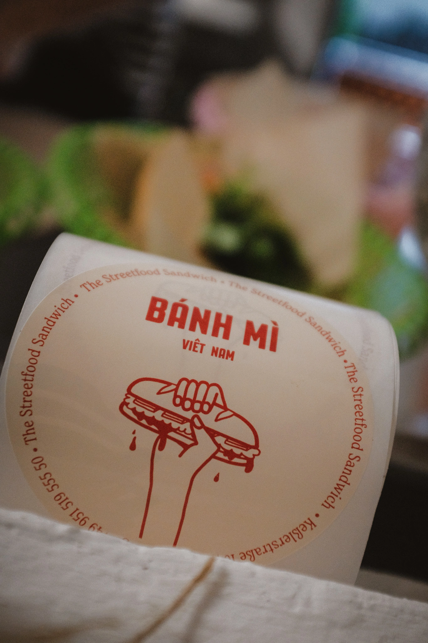
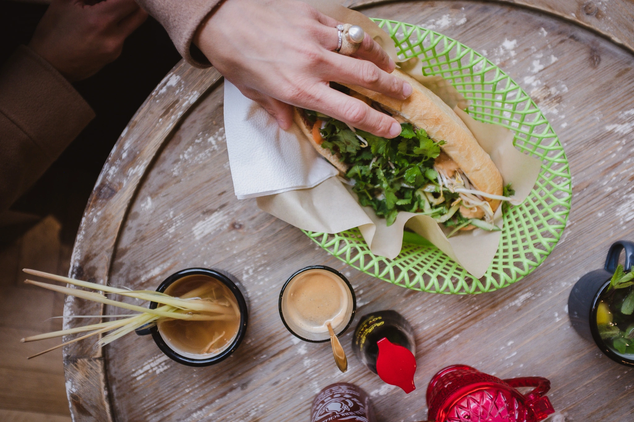
CHALLENGE
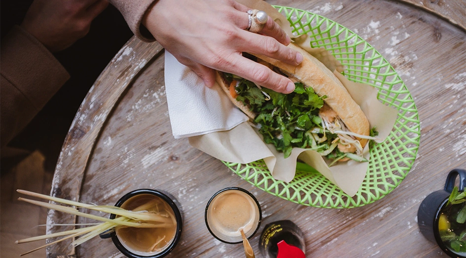
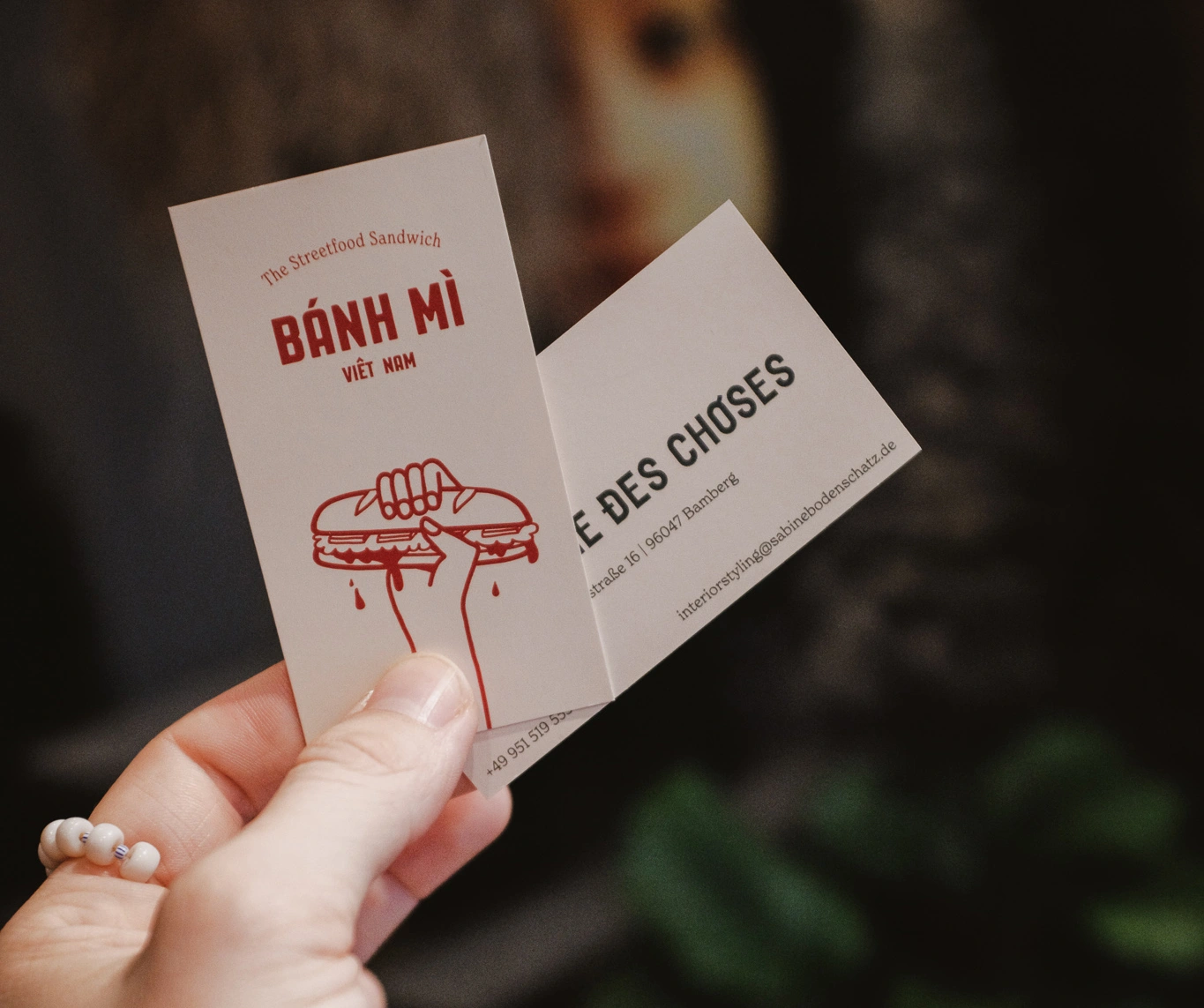
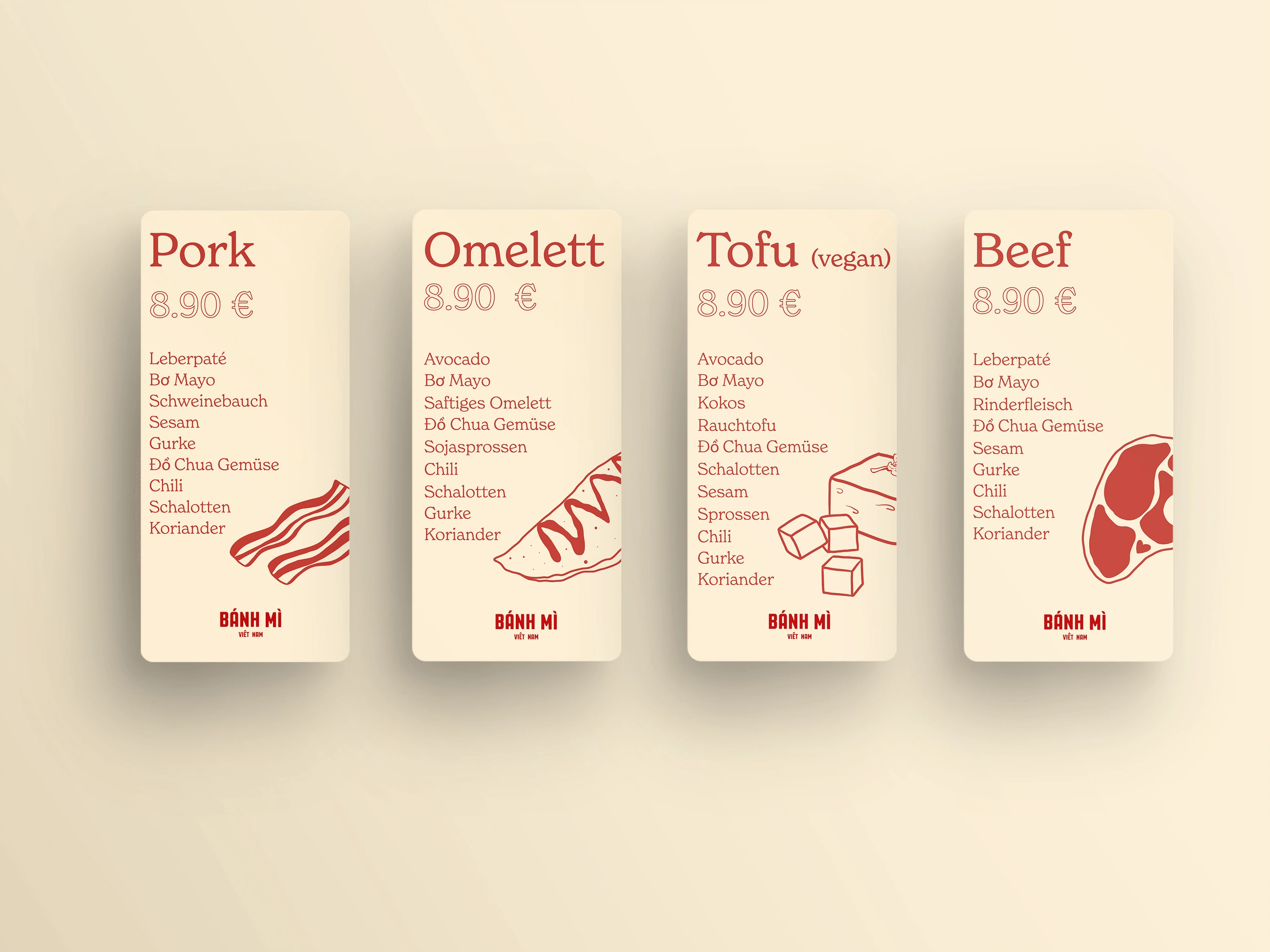
Pharmacie des Choses is an “Eat and Shop” concept inspired by Vietnamese–French colonial interiors, combining a curated boutique with a Bánh Mì café under one roof. The core challenge was to develop two distinct brand identities that could live side by side without competing. Each needed its own voice and character—one refined and design-led, the other warm and street-inspired—while still feeling part of a coherent whole.
APPROACH
For Pharmacie des Choses, the identity leans into vintage French colonial influence, expressed through refined typography, balanced layouts, and understated elegance that reflect the carefully selected furniture and décor. In contrast, Bánh Mì introduces a more relaxed and playful tone. Hand-drawn illustrations of fresh ingredients, street vendors, and familiar Vietnamese scenes bring energy and authenticity to the café’s presence. While distinct in personality, both identities share a considered visual framework, ensuring harmony within the shared space and reinforcing the overall concept.


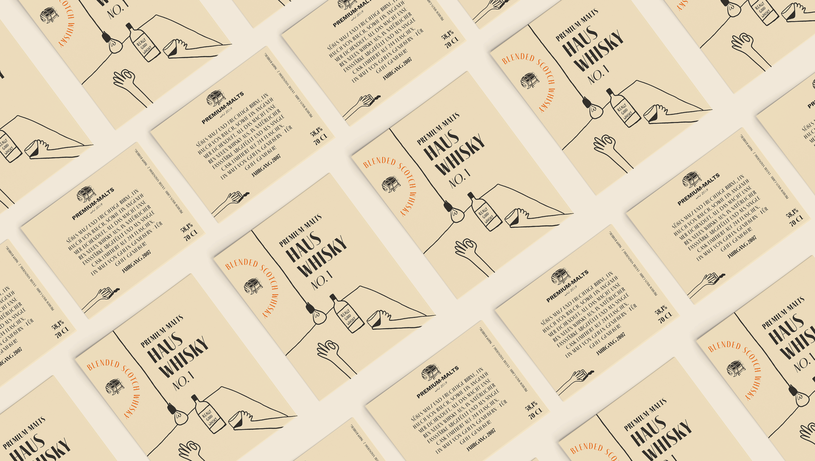
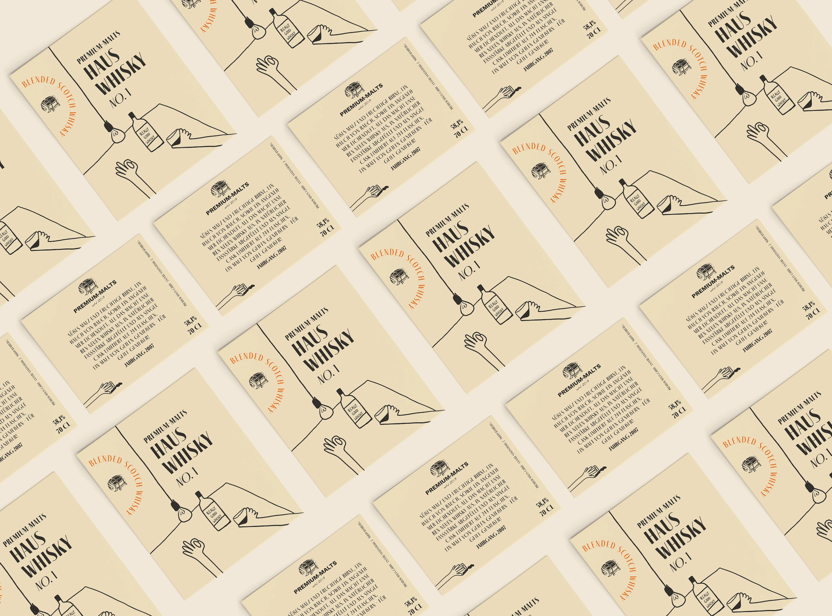
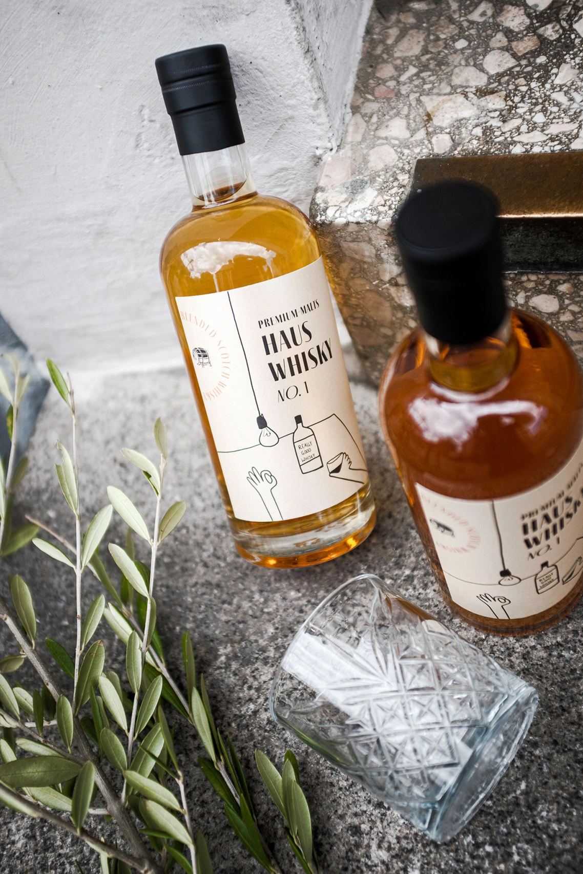
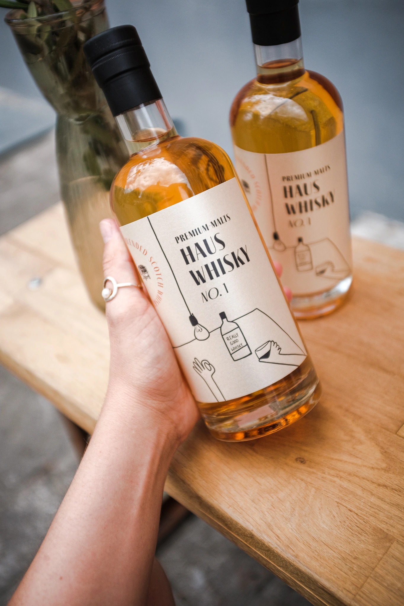
CHALLENGE
This gastronomic concept speaks to bon vivants and cosmopolitans who value exceptional food and wine, enjoyed in an environment that feels both curated and comfortable. The challenge was to craft a brand identity that captured this duality—elevated yet inviting, minimalist yet warm—without tipping too far into formality or casualness.
APPROACH
The visual language was built around restraint and refinement, using clean typography, balanced compositions, and a considered color palette to convey sophistication. At the same time, subtle tactile and tonal elements were introduced to create a sense of intimacy and ease. The result is an identity that feels confident and contemporary while remaining approachable—mirroring the atmosphere the concept aims to offer its audience.
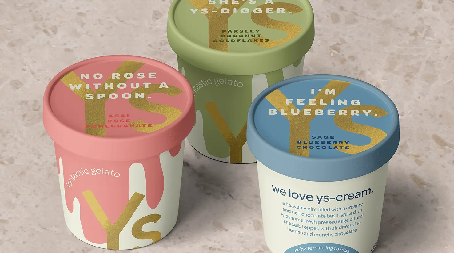
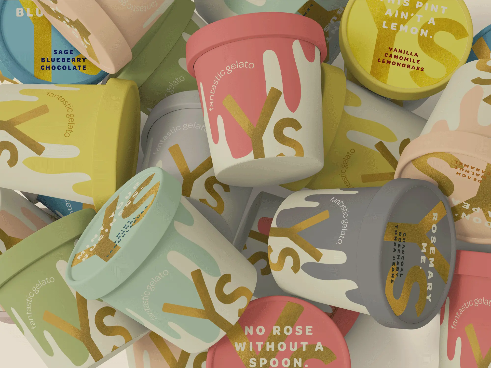
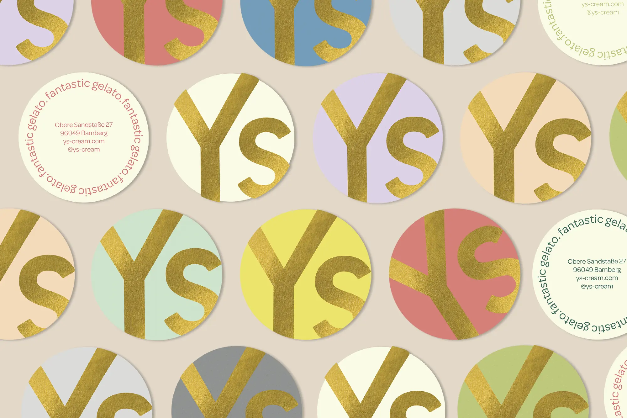
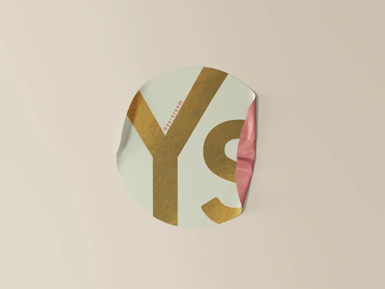
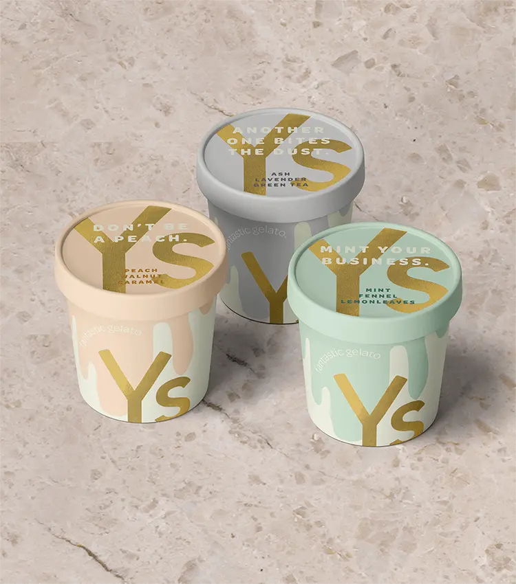
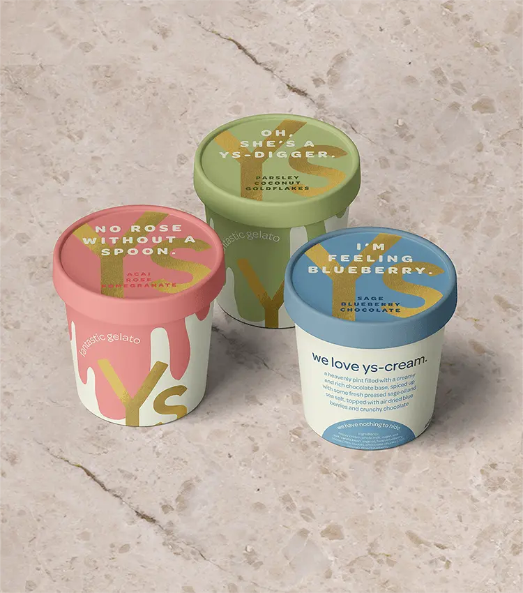
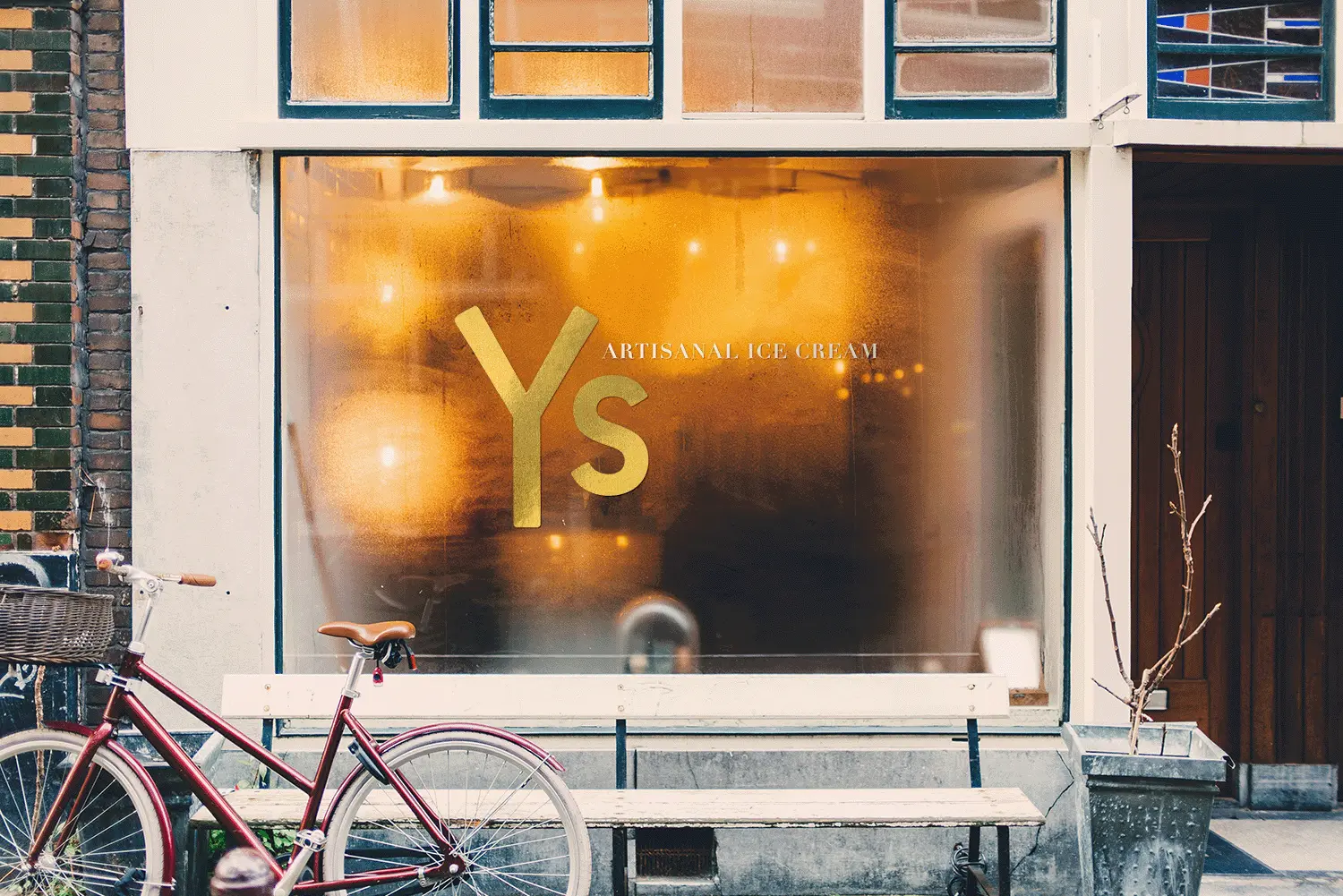
CHALLENGE
This young, high-quality ice cream concept needed a brand identity that felt playful and full of character while clearly communicating transparency and quality. The challenge was to strike the right balance between fun and credibility, creating a system that could scale effortlessly across packaging, merchandise, and future touchpoints without losing clarity or consistency.
APPROACH
The identity was built to reflect both joy and trust. A flexible visual system allows seamless application across a wide range of merchandise, giving the client room to grow while maintaining a cohesive presence. By capturing a sense of lightheartedness alongside a strong commitment to quality, the design supports the brand’s expansion goals and invites customers into a memorable, feel-good experience.